
July 29
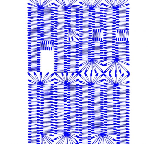
Broad Pen Curves
Spring lock down 2020 opened a space for experiments with letters drawn with parallel (broad nib) pen.
July 22
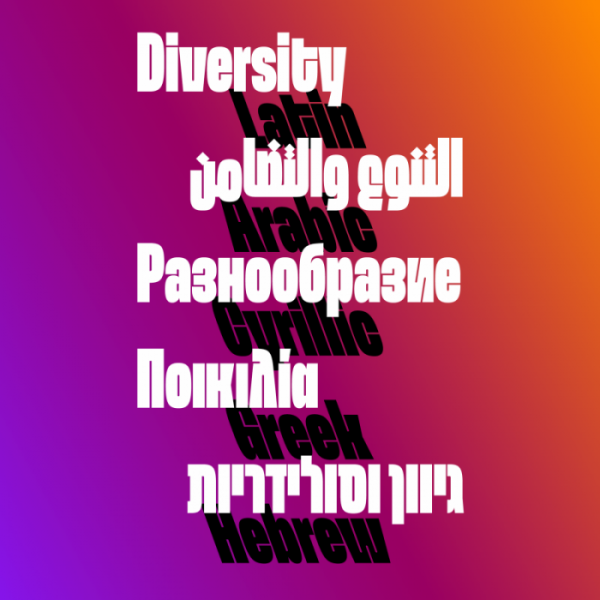
SPEKTRA multi-script type family
The idea behind the Spektra type family was born during the covid-19 pandemic. Krista Likar and me (founder of Type
July 18
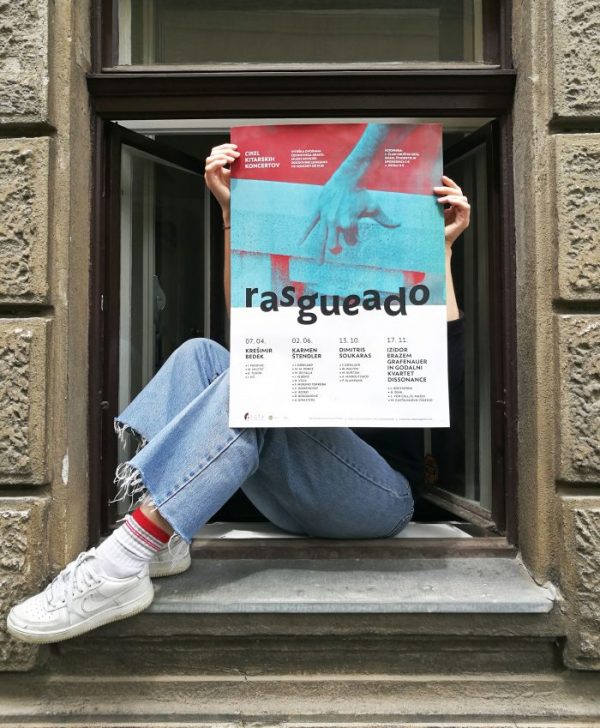
Rasgueado
Rasgueado, Rasgueo or Rasgeo in Andalusian dialect and flamencojargon, or even occasionally Rasqueado) is a guitar finger strumming technique commonly associated
July 17
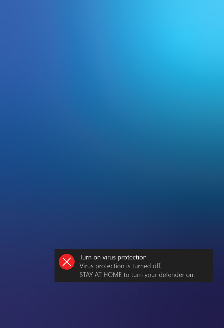
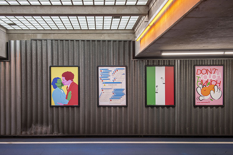
STAY SANE STAY SAFE
During the quarantine I designed few posters on the current state of my mind. Happy and super excited that my

March 25
Univerza Sans
Available at TYPE SALON. Univerza Sans is hybrid between humanist and geometric sans, inspired by Slovenian avant-garde. Multifunctional use for identity

March 14
How to shape your Latin?
While my visit in Jordan, I was mentoring a Latin type design workshop in Elharf House, Amman. We focused into
December 16
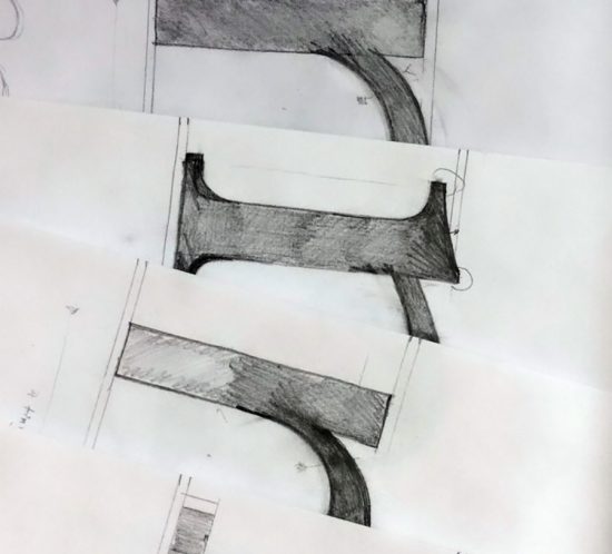
Precise type sketching
Majority of my sketches include random & abstract letter shapes grown in my head. Rarely I am sketching the existing
December 5
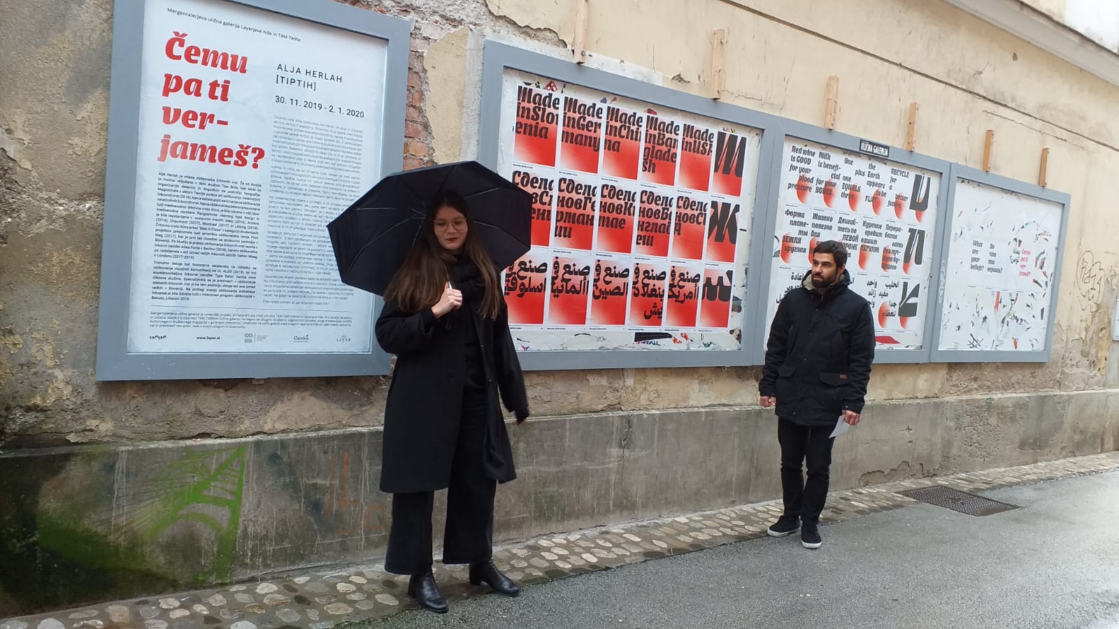
What are your beliefs?
I got an opportunity for exhibiting the latest updates on Alica type family- added Cyrillic and Arabic script. This exhibition

October 22
Adria – logo refinement
Logo of Slovenian Adria Airways is probably not going to be in use any longer so I am taking the
September 30
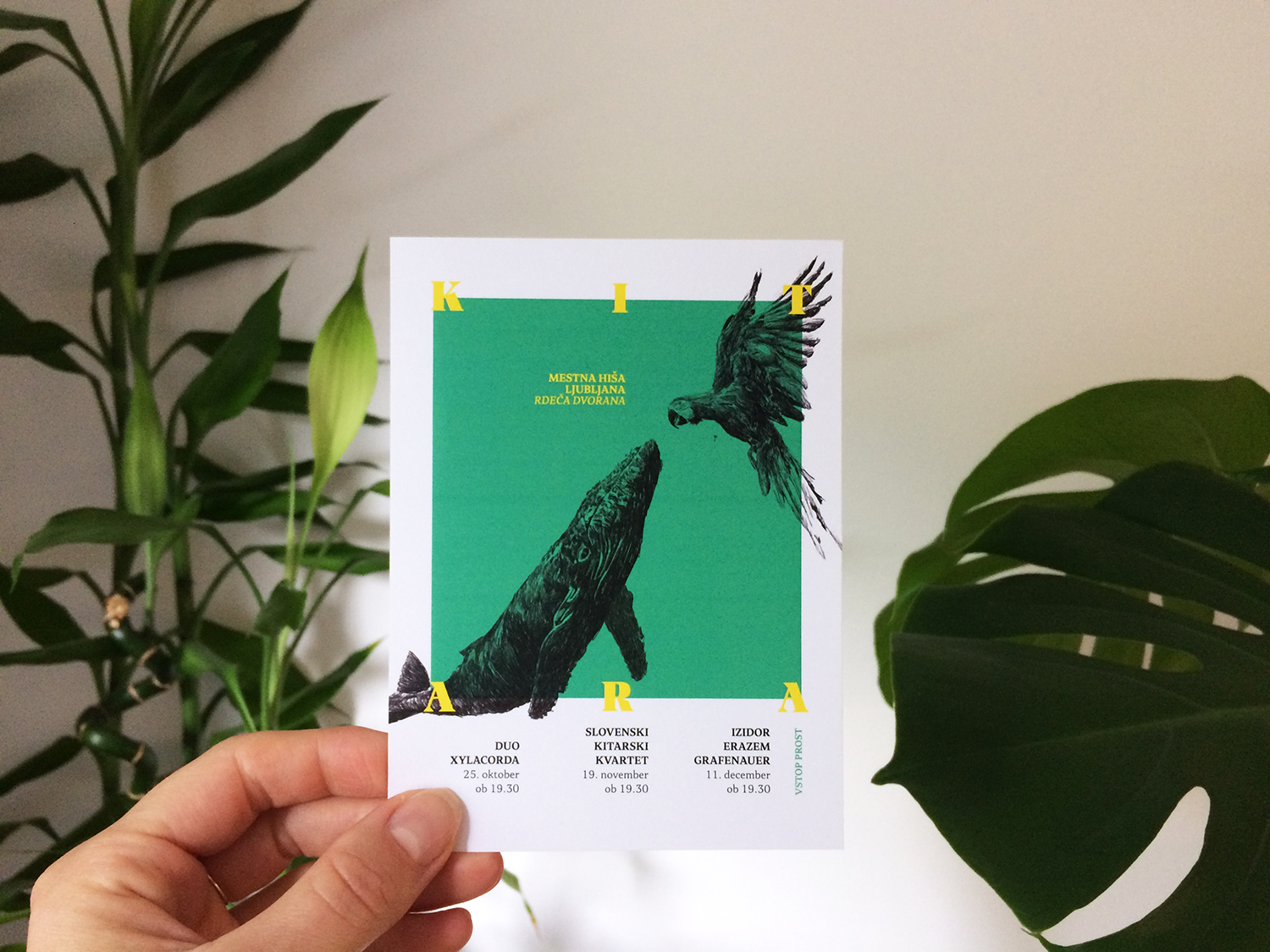
KIT ARA poster
I designed this poster for the cycle of three guitar concerts named Kitara. The word guitar translated into Slovenian language
August 10
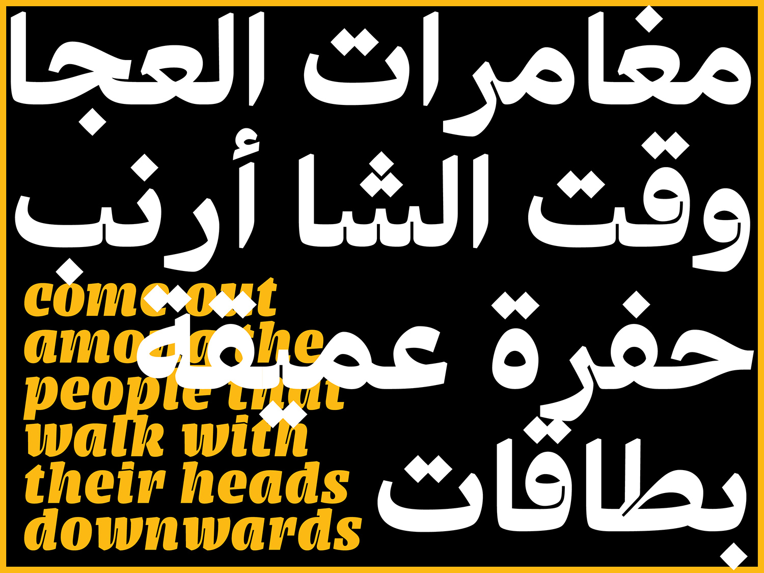
Arabic Type Design Beirut
I have attended the Arabic Type Design 2019 workshop in Beirut.The intesive 2 weeks long workshop was led by Kristyan
July 1
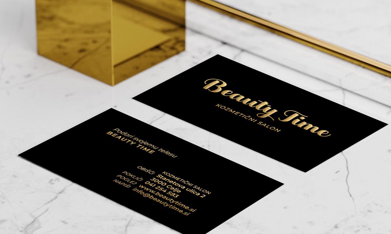
Beauty Time branding
Beauty Time is beauty, cosmetic salon located in Celje, Slovenia. My work includes logotype design, menu design, poster, flyer, voucher, hand
July 1
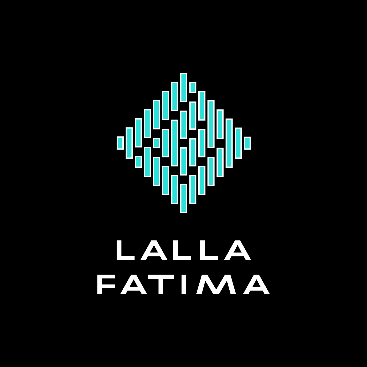
Lalla Fatima branding
Lalla Fatima is a boutique shop located in Berlin, selling Moroccan handmade accessories. The logotype is inspired by the traditional

May 12
To sem jaz (this is me)
To sem jaz is a non-profit organization supporting children with autism disorders in their families, contributing the awareness about this disorder

March 27
Type Days Ljubljana 2019 (as mentor)
I was mentoring intensive type design workshop Type Days 2019 Ljubljana, 23 – 25 March in Poligon - creative center.
February 13
Twenty Nineteen Series

September 16
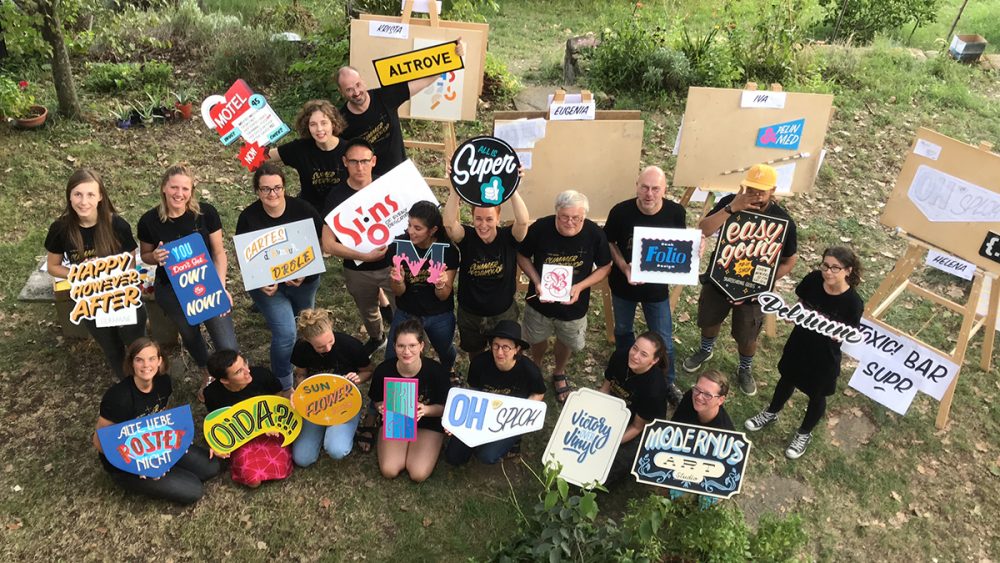
34th Tipo Brda – Sign Painting Workshop (as organizer)
I participated in the Tipo Brda workshop for the first time in the winter of 2014. It is an intensive
Loading new posts...
No more posts