Univerza Sans
Available at TYPE SALON.
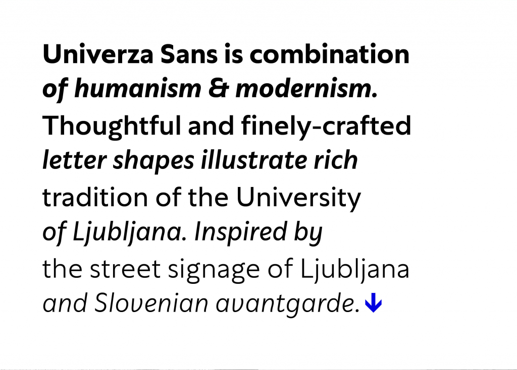
Univerza Sans is hybrid between humanist and geometric sans, inspired by Slovenian avant-garde. Multifunctional use for identity system, formal communication, way finding, academic and scientific articles in order to share the institution’s spirit of knowledge, creativity, diversity and belonging. It speaks Central European languages, feels official but looks attractive and recognizable.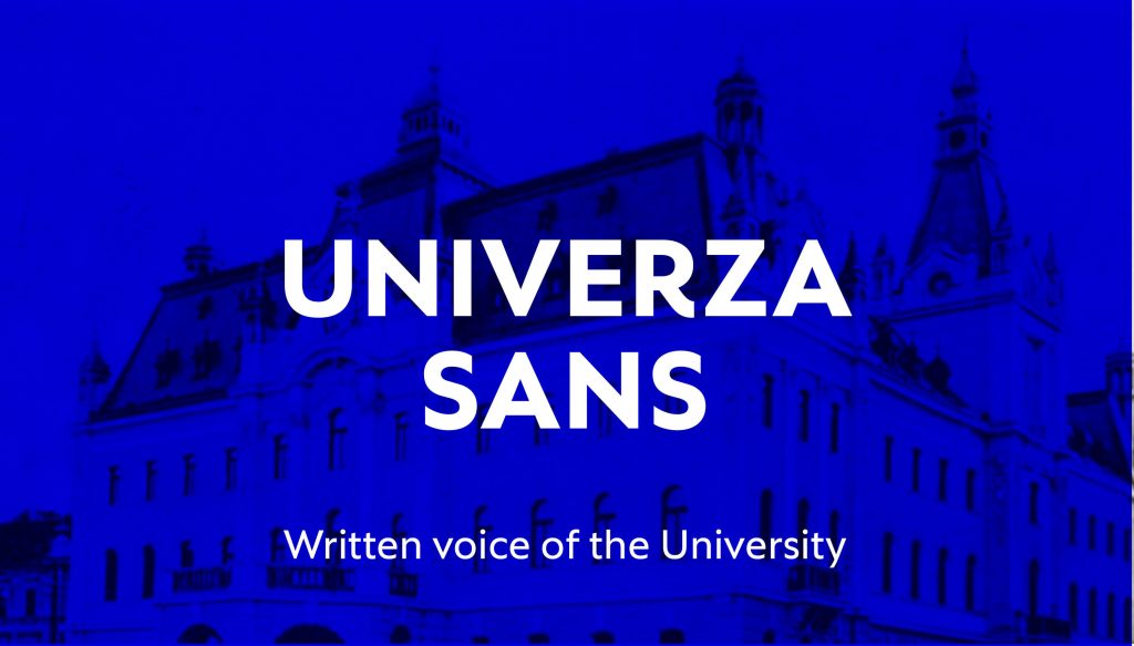
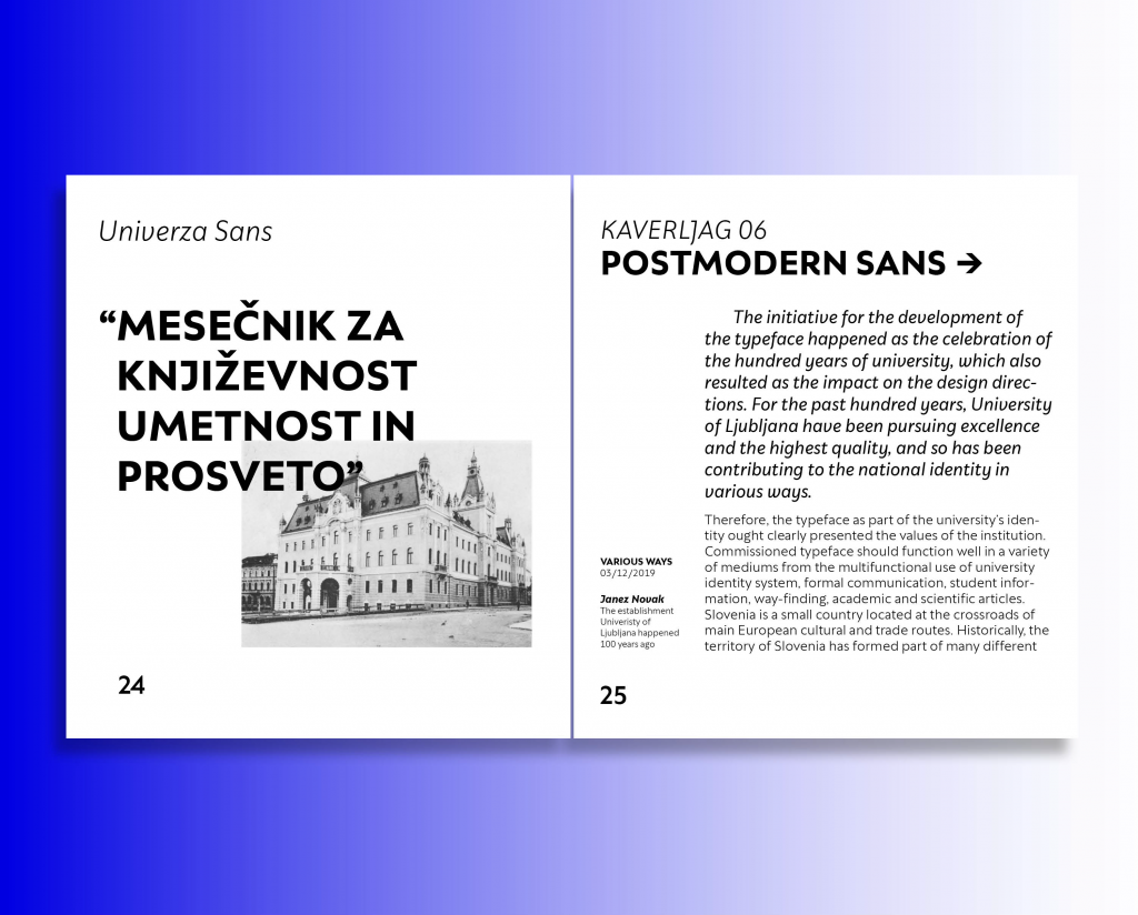
The initiative for development of the custom typeface for University of Ljubljana was made as the celebration of a hundred years of its establishment. Development of this typeface initiated with the question: How to present the voice of institutions with letters? As the oldest and largest higher education and scientific research institution of Slovenia, the University carries out activities involving scientific research, education, art, expertise For the past hundred years, University of Ljubljana has been pursuing excellence with high quality, and so it has been contributing to the national identity in various ways. The typeface as part of the University’s identity shall clearly present the values and importance of the institution. The anniversary is presenting significant impact on typeface’s design directions. In addition, commissioned typeface should function well in a variety of mediums from multifunctional use of University identity system, formal communication, student information, way-finding, academic and scientific articles.

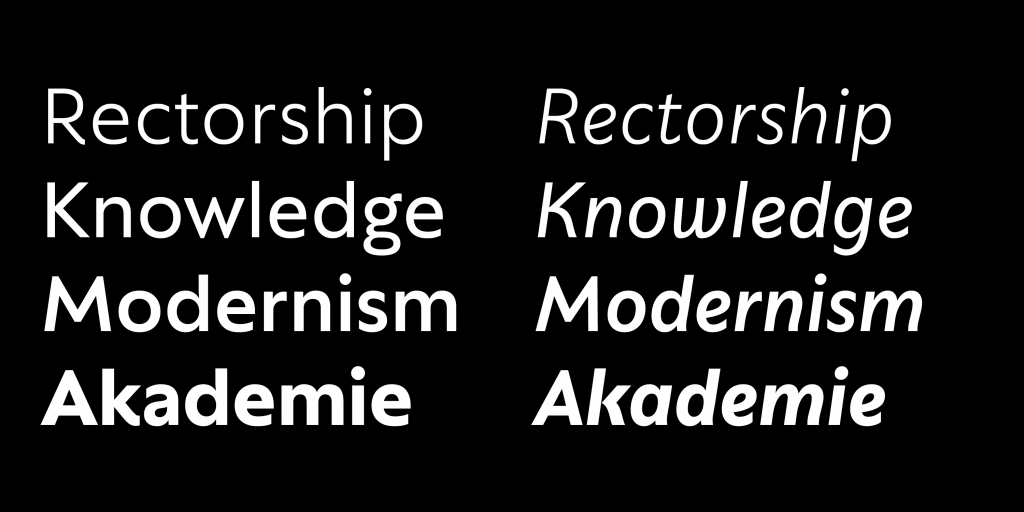
Human dignity seems the fundamental value for the base of the development. The style direction of the typeface was influenced by Gill Sans, a humanist sans-serif typeface developed at the beginning of the 20th century. Gill Sans was commissioned as the competitor of the German geometric sans style faces. Vertically cut terminals give the typeface human character, presenting human rights and equal possibilities. Those details of terminals look classic and modern at the same time, even more if presented as a formal-informal voice.
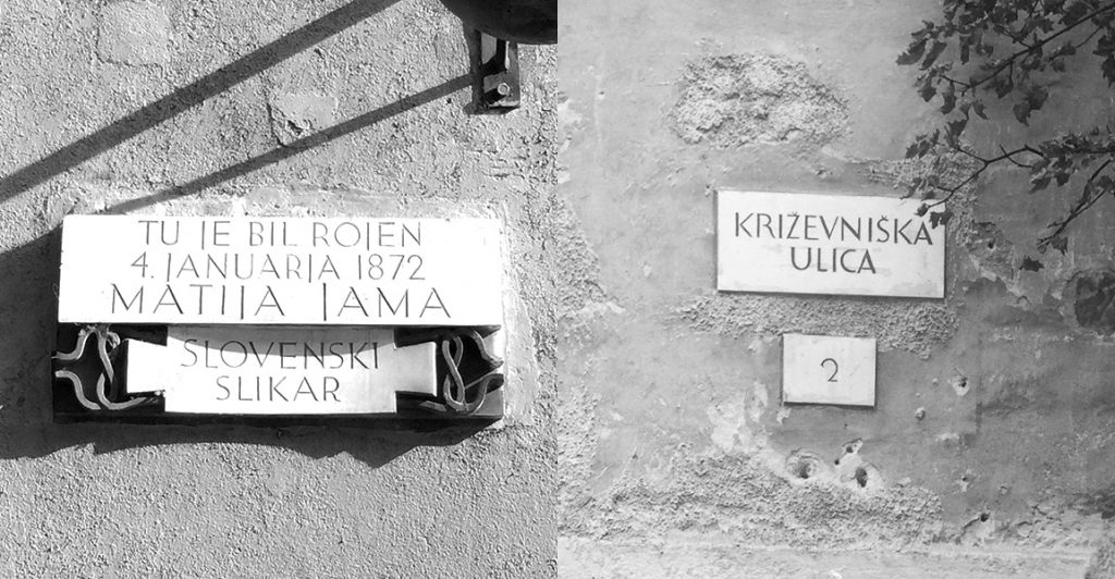
Roman proportions of uppercase characters are referencing the rich history of the city. Ljubljana was built on the roots of Roman city Emona from 100 years BC. The features presenting diverse heritage are also shown in the style of the typeface, hybrid of geometric and humanist sans. Geometric forms are in line with the avant-garde art movement in the University’s early years of the establishment. Better understanding of the history can contribute to the awareness of the present and future as well. Letter shapes, interwoven by the Slovenian art heritage are leaning on Slovenian past and at the same time being a base for a present design and future usage.


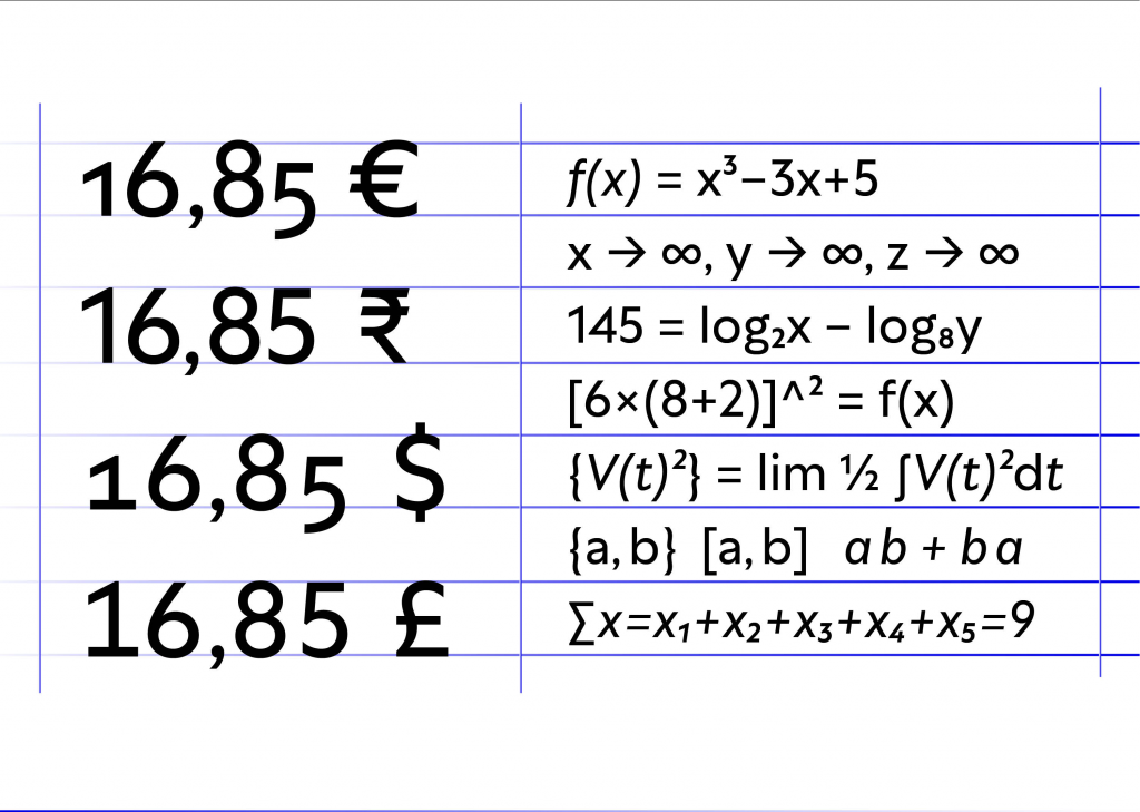
Geometrical bowls, generous x-height and open counter shapes stand for academic freedom of staff and students, especially the freedom of creativity. In a sense of a design, creativity is well interpreted within the italic forms. Basic shape of lowercase ‘n’, which is in professional terms set as the base for other italic shapes, shows an uncommon solution of terminating a vertical stroke. Usually, stroke finishes in an upward direction, it rarely finishes on the baseline in the cursive movement. Special focus was put on the letter ‘k’, where the diagonal line does not touch the stem. Character set includes some alternative shapes for glyphs in roman and italic style. The font family speaks Central European languages and covers the character range of 220 languages. It is compact and efficient with four weights, Light, Regular, Medium and Bold, each weight is represented with the italics and optimized for print and digital media. Corresponding with the weight, character set includes a set of icons which could be used for University signage and wayfinding – from toilets to classroom.

We found the value belonging as determining feature of the identity system. Referencing the students, as a representative part of the University, we developed some recognisable features to evoke the memorability of the typeface. Belonging is presented with recognisable national variants of glyphs J, K and R. Special focus was put on the combination of the letters ‘L’ and ‘J’. The combination is commonly used in Slavic languages, especially Slovenian and Croatian. Evenmore, this combination is used in an important word – Ljubljana. Set in uppercase letters, it forms an unpleasant large amount of white space, commonly mistaken by the letter ‘U’. For this reason, we proposed an alternative shape ‘J.ss01’, contextual alternative when ‘J’ follows the letter ‘L’. Another feature, vertically cut diagonals of ‘k’, ‘K’ and ‘R’ correspond to the recognizable lettering of the most important slovenian architect, Jože Plečnik. Thoughtful features and forms are the characteristics that present the local authenticity and could be well presented as the high quality and excellence in the global environment.

Geometrical bowls, generous x-height and open counter shapes stand for academic freedom of staff and students, especially the freedom of creativity. In a sense of a design, creativity is well interpreted within the italic forms. Basic shape of lowercase ‘n’, which is in professional terms set as the base for other italic shapes, shows an uncommon solution of terminating a vertical stroke. Usually, stroke finishes in an upward direction, it rarely finishes on the baseline in the cursive movement. Special focus was put on the letter ‘k’, where the diagonal line does not touch the stem. Character set includes some alternative shapes for glyphs in roman and italic style. The font family speaks Central European languages and covers the character range of 220 languages. It is compact and efficient with four weights, Light, Regular, Medium and Bold, each weight is represented with the italics and optimized for print and digital media. Corresponding with the weight, character set includes a set of icons which could be used for University signage and way finding – from toilets to classroom.