34th Tipo Brda – Sign Painting Workshop (as organizer)
I participated in the Tipo Brda workshop for the first time in the winter of 2014. It is an intensive one-week long Type Design Workshop which opened my eyes and made me fall in love with letters. Spending the whole week in the house full of nerdy font developers, only talking about letter shapes is an experience, which is difficult to explain to the outside world.
Since then, I have become an active member of the Tipo Brda organisation and got the opportunity to co-organise the workshops. Myself and the team spend (too many) hours in front of our computers, refining the course. When planning the summer ’17 workshop with Krista (co-organiser) we decided to take a step away from digital design. We invited Jakob Engberg (Copenhagen signs) to mentor the sign painting workshop. It turned out great! Only the thought of last year’s workshop makes my heart race! When we started planning this year’s workshop, we couldn’t resist inviting Jakob again.
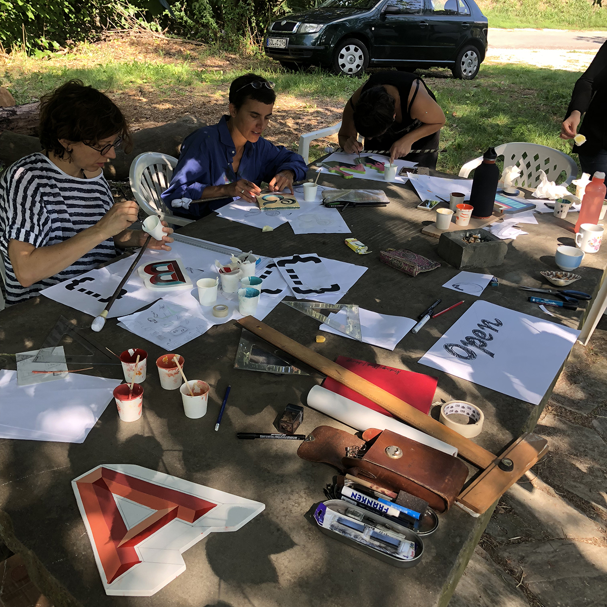
Tipo Brda holds two workshops a year – winter and summer edition. The summer one is normally located in the middle of the wine growing hills above the Adriatic sea. This year we had 15 participants, which is nearly the maximum the studio house can hold.
On Sunday afternoon we gathered around, getting to know each other and got ourselves into the “summer camp” mood. As an intro to the workshop, everyone made his/her own handmade “mahlstick” from a wooden stick, piece of cotton and glue tape. A mahlstick/maulstick is a stick with a soft padded head used by painters to support the hand holding the brush.
Day 1
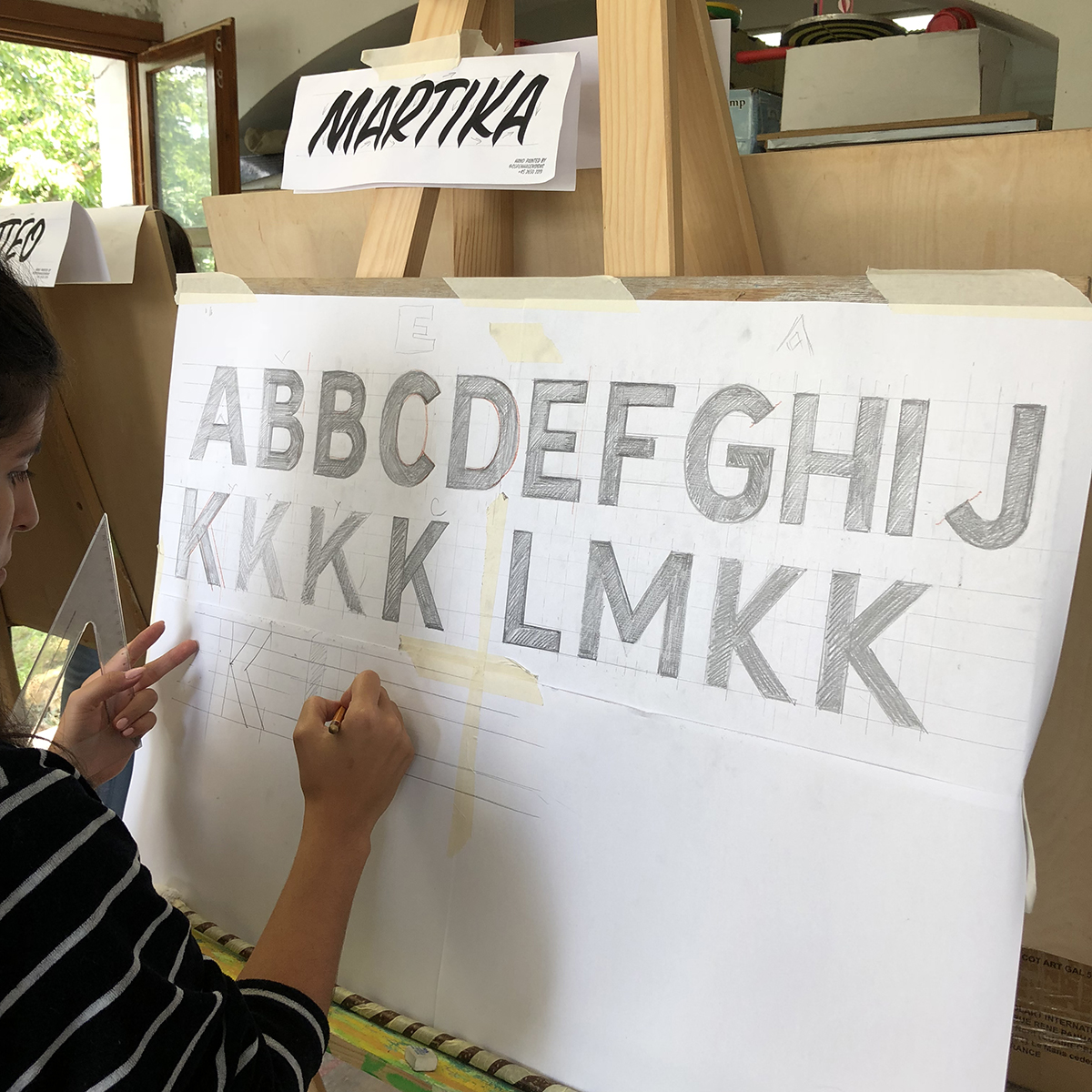
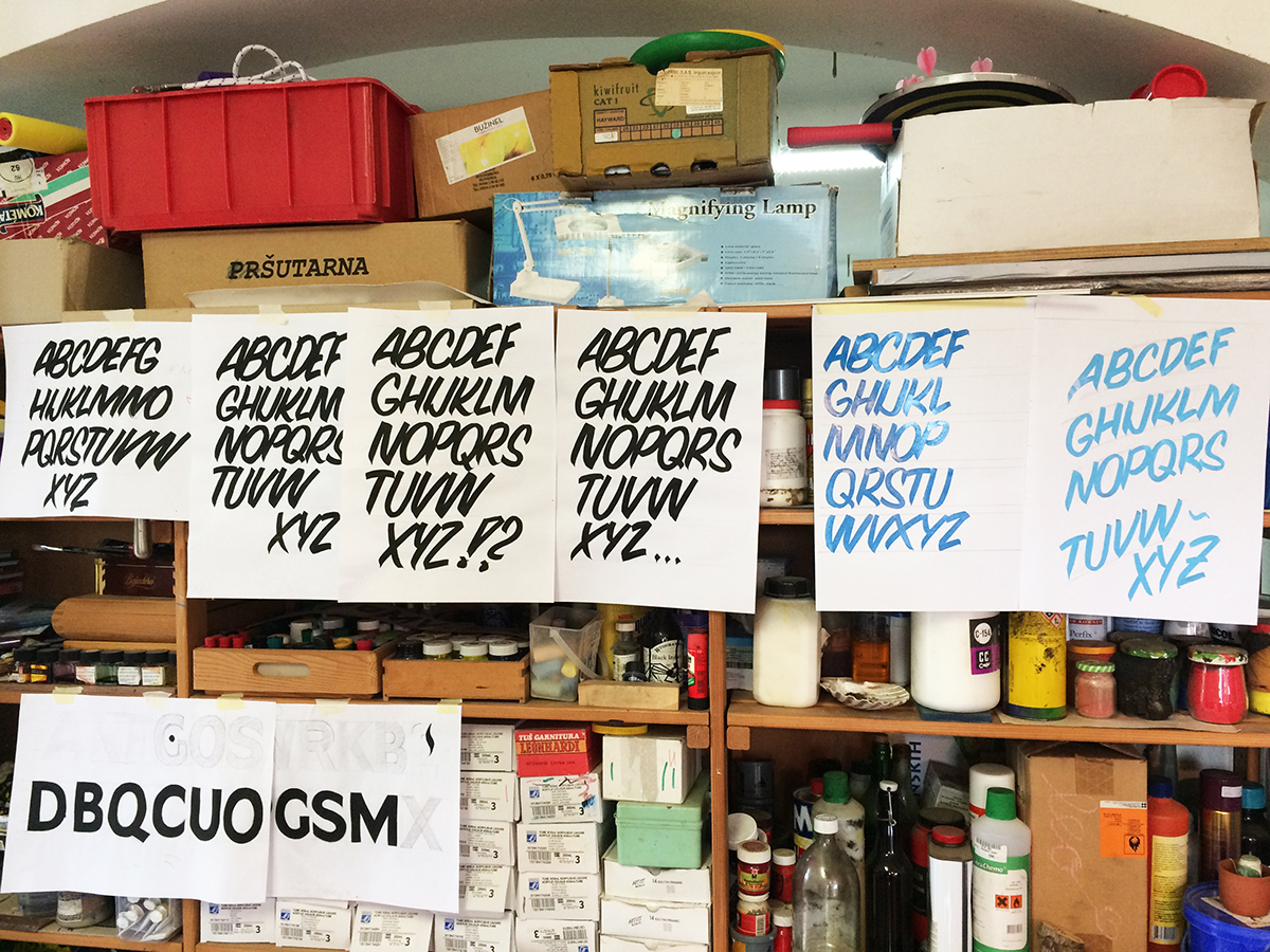
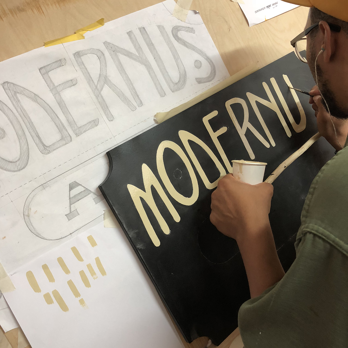
After breakfast, Jakob introduced us to basic block letters. In other words, how to draw mono-linear sans with a ruler and pencil.
 We sketched the outline of the alphabet in uppercase, grotesque-looking shapes, which are in sign-painting terminology known as block letters.
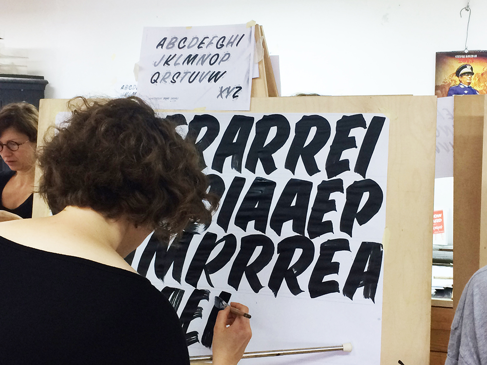
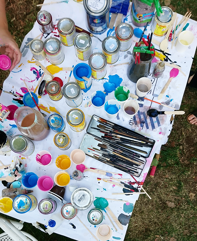
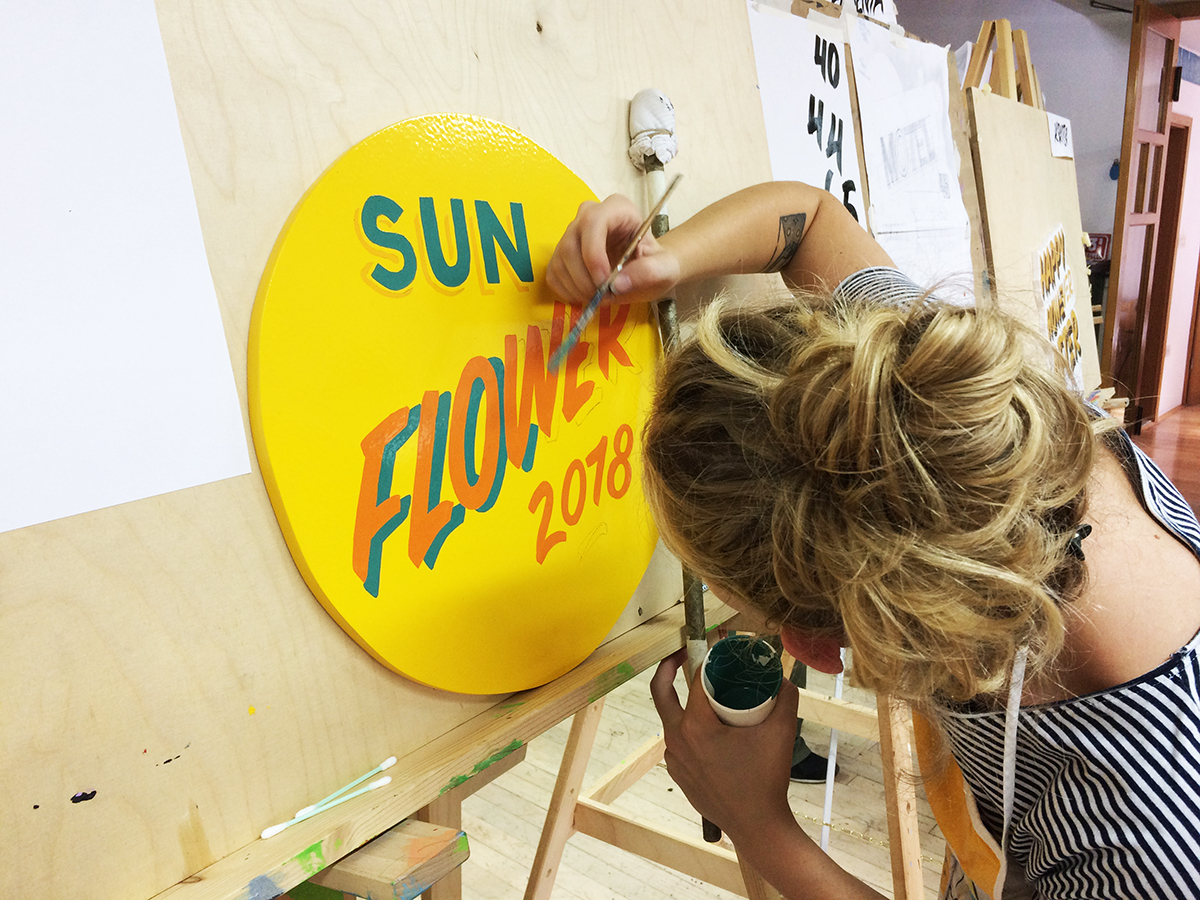
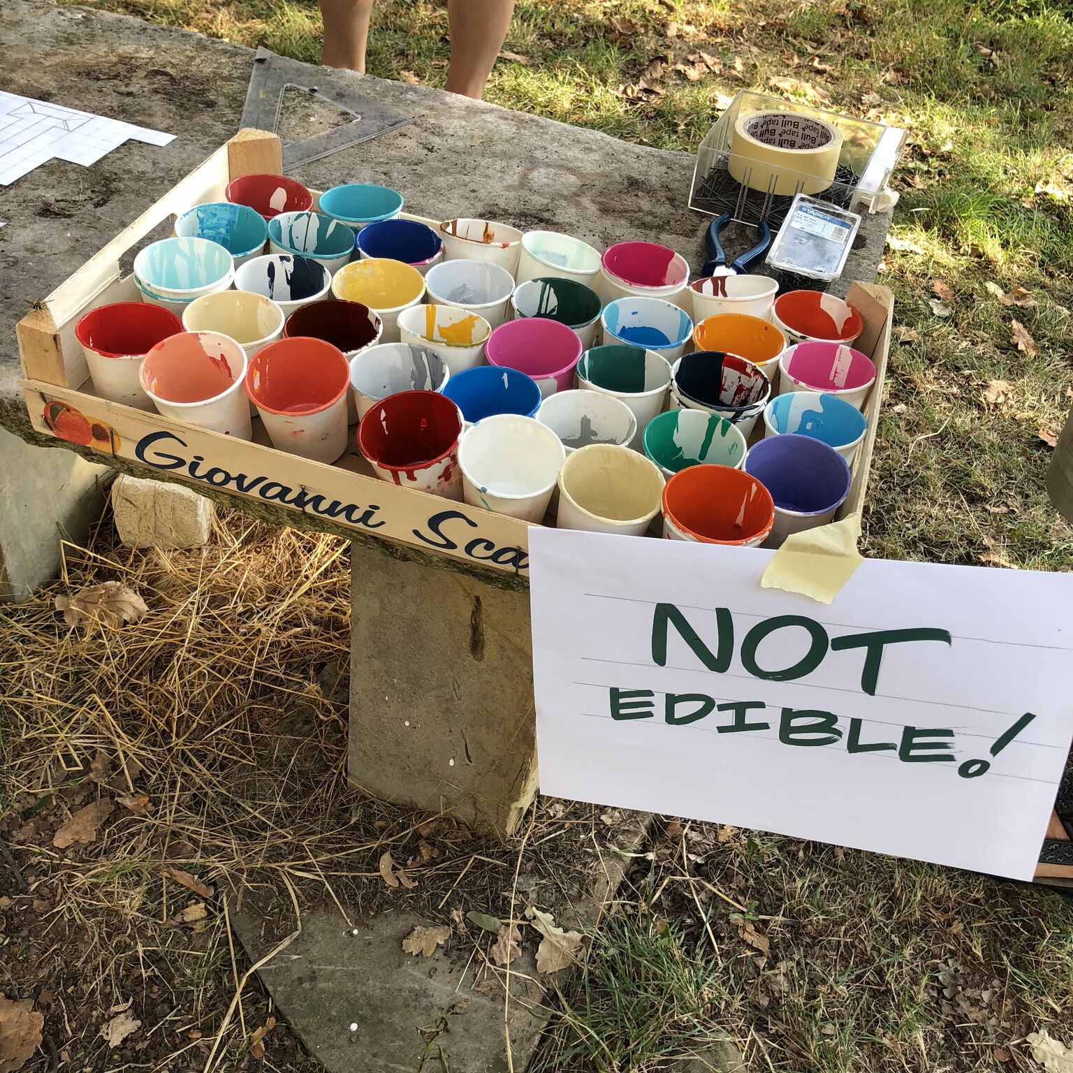
After lunch, we moved on to basic shapes made with brush and acrylic colours. We only worked using vertical, horizontal and round basic strokes, which may sound super easy, but in fact, it is not. Getting used to the sign-painting brush can takes a bit more time than expected.
Day 2
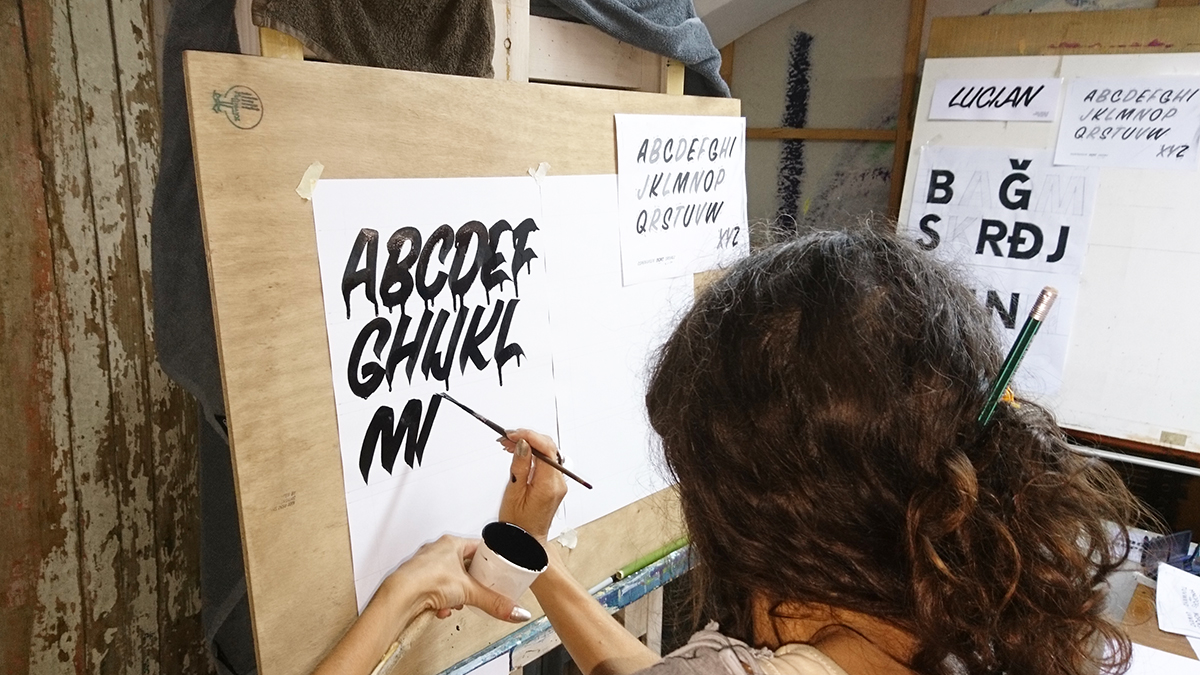
We started day 2 by “filling” up our block letters. Using brush nu.6, black acrylic and the mahlstick.
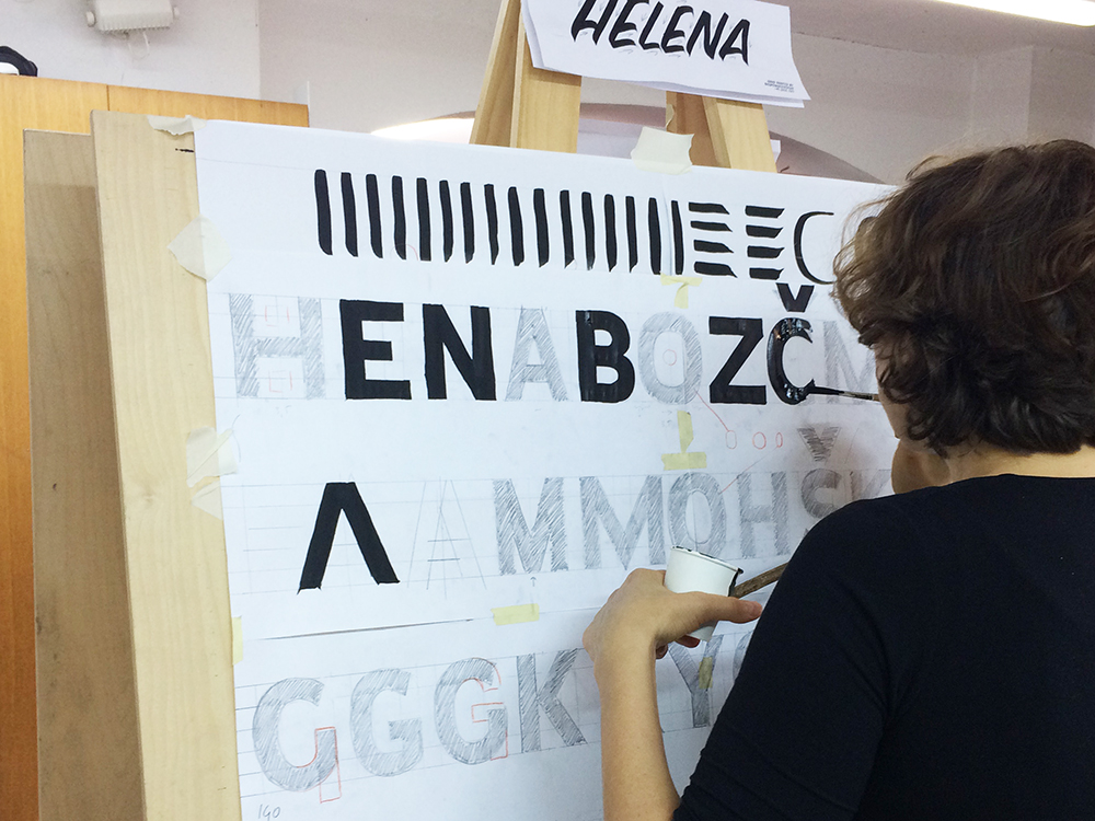
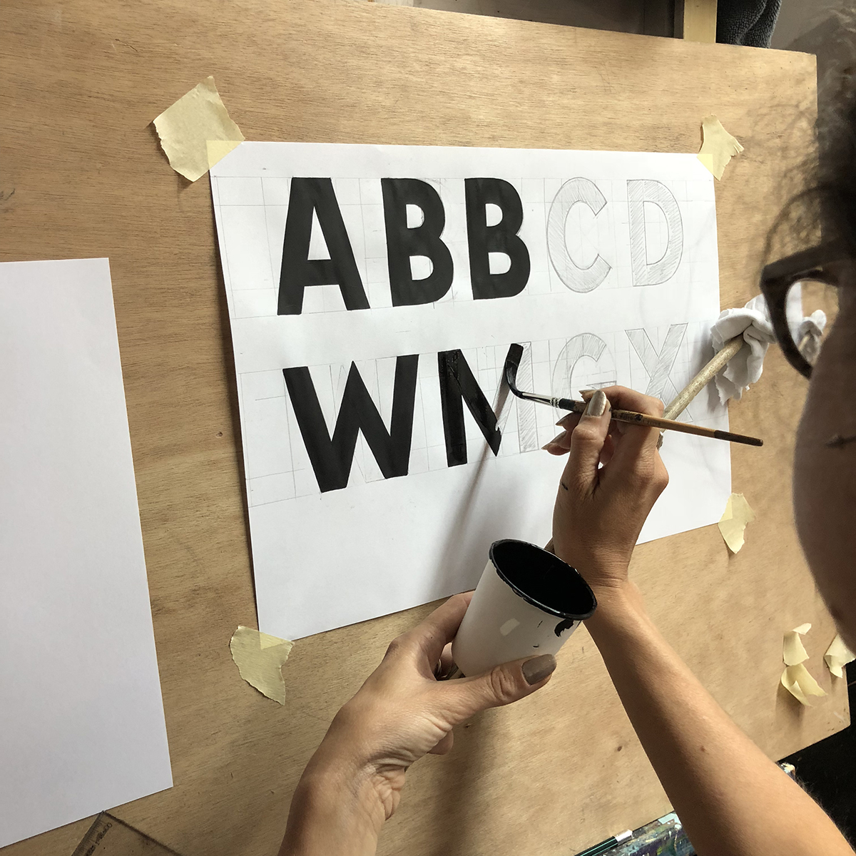 The block letters we sketched the previous day served as an example of lettering. We used the same technique for our signs later in the week – sketching the letters and then filling them up with paint.

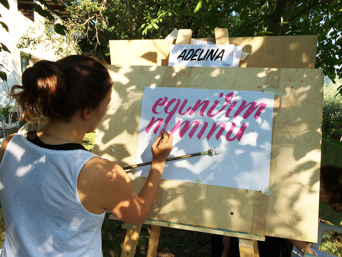
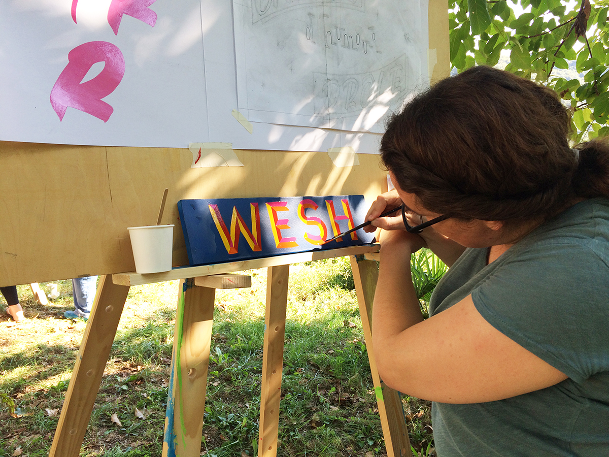
Later on, Jakob introduced us to the basic sign painters script called Casual. This style of letters tends to lean to the right side, which gives movement to the letters. Depending on the angle of the slant you use, the “faster” it appears. Of course it’s not only about slanting the letters. What makes the script look great is the ending of the stroke. This is done by twisting the nib of the brush either to the right or the left side (depending on the shape of the letter).
Day 3
We took advantage of a great summer-ish day and moved our workstation outside. As an intro to day 3, Jakob explained different ways of shading the letters.
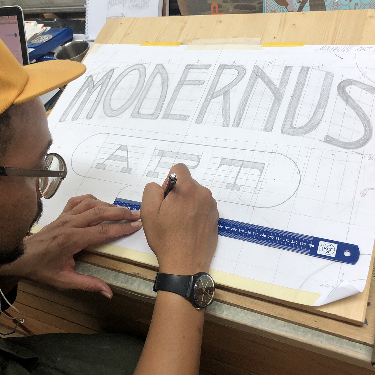
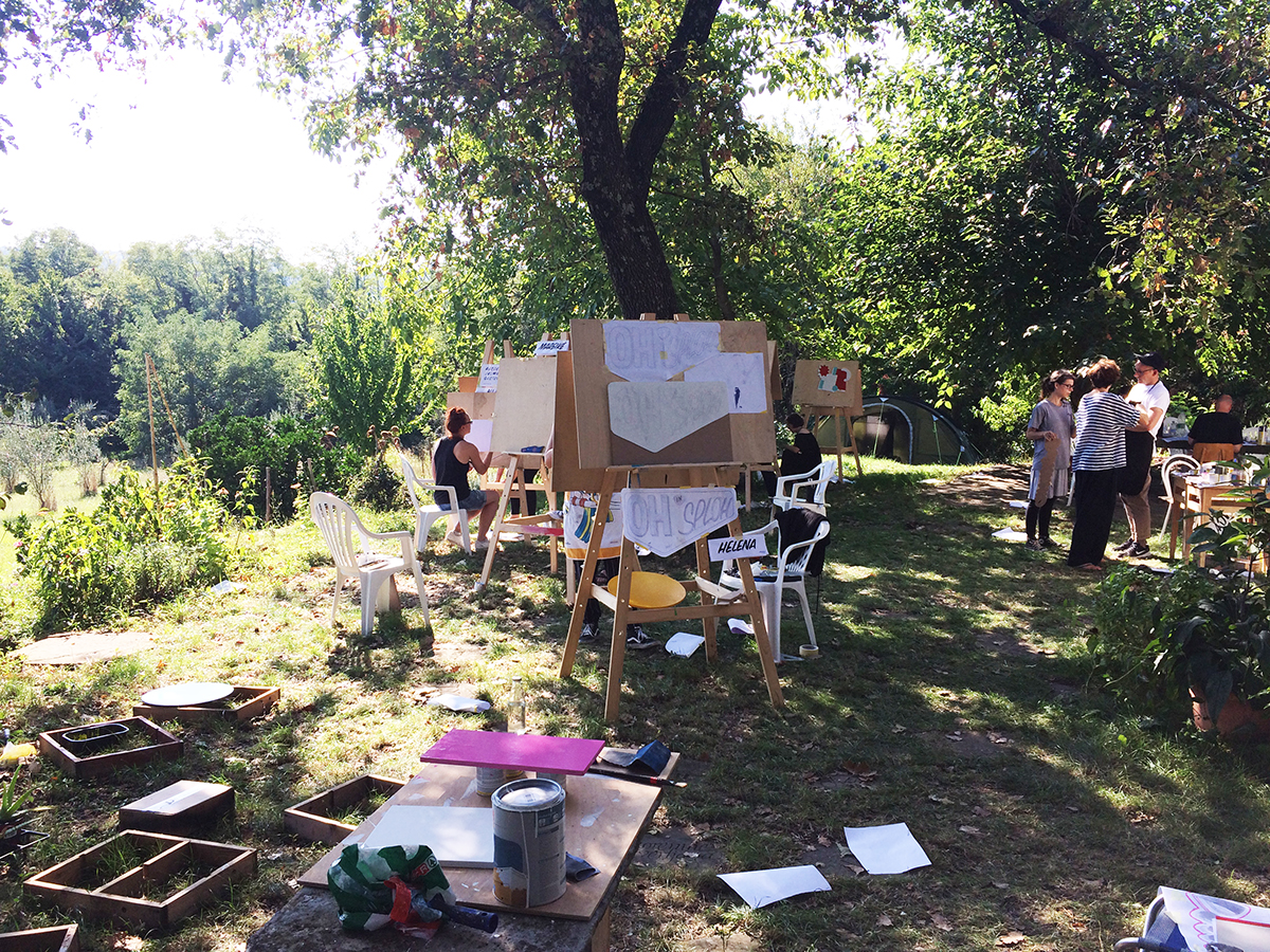
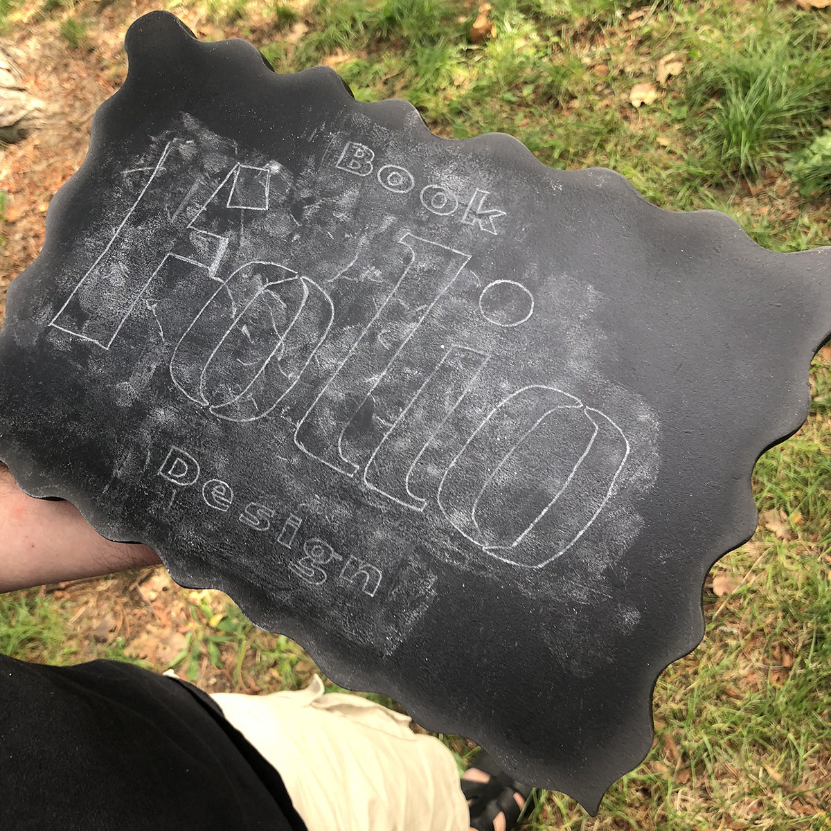
The plan for the day was to sketch the design for the signs. Some of the participants finished the design so they were also able to apply the shape onto the wooden MDF panel and cut it out using a jigsaw.


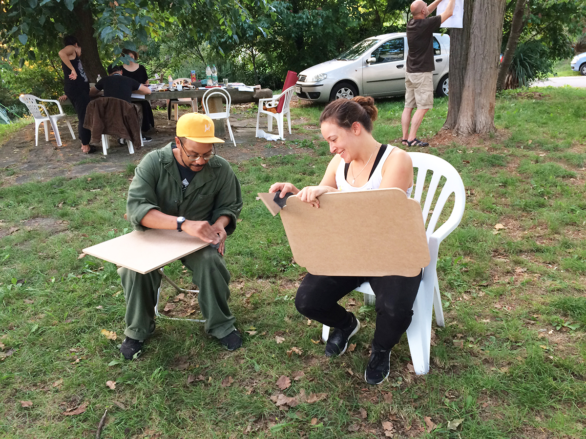
Before putting the first coat of the primer on the panel, we had to sand the surface in order to get that smooth, glossy look. After it was polished, we primed the panels with white acrylic.
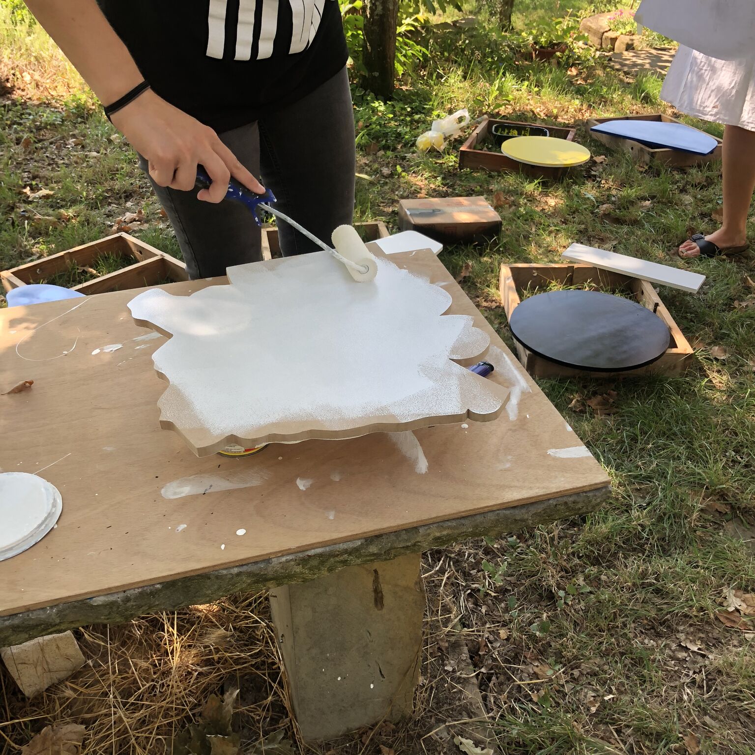
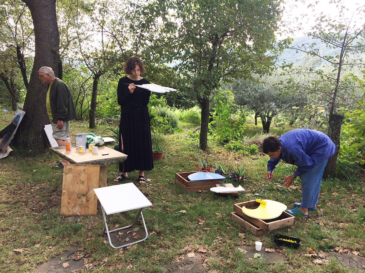
For the background colour of our panels, we used sprays. To obtain an everlasting sign, oil-based paint is normally used as the base. This however takes a few days to dry so instead we used sprays.
 While waiting for the paint to dry, we continued to sketch the design of our signs. Some preferred to put the easel outside and work on their brush script for a little longer.
In the afternoon, some of the participants took a few hours off to go swimming in the sea. I noticed people were more relaxed when they came back from the beach. Jumping in the sea brought smiles to the participants’ faces. The first few days, we were a bit “tense’” – new people, new place, but after jumping into the water, the mood really loosened up. It also relaxed the atmosphere of the group which got a bit tense while sketching the design.
In the evening we gathered for a movie night – screening the Sign painting movie :)
Day 4
For those who had already finished with the sketches, they transferred them onto the panel using the pouncing technique.
Pouncing technique:
1. With the help of a seam roller, we made small holes in the paper to make the pounce pattern.

2. Using bags full of pounce powder, we pounced the paper in order to transfer the sketches onto the panel.
It was then time to open the Oneshot colours!
Day 5
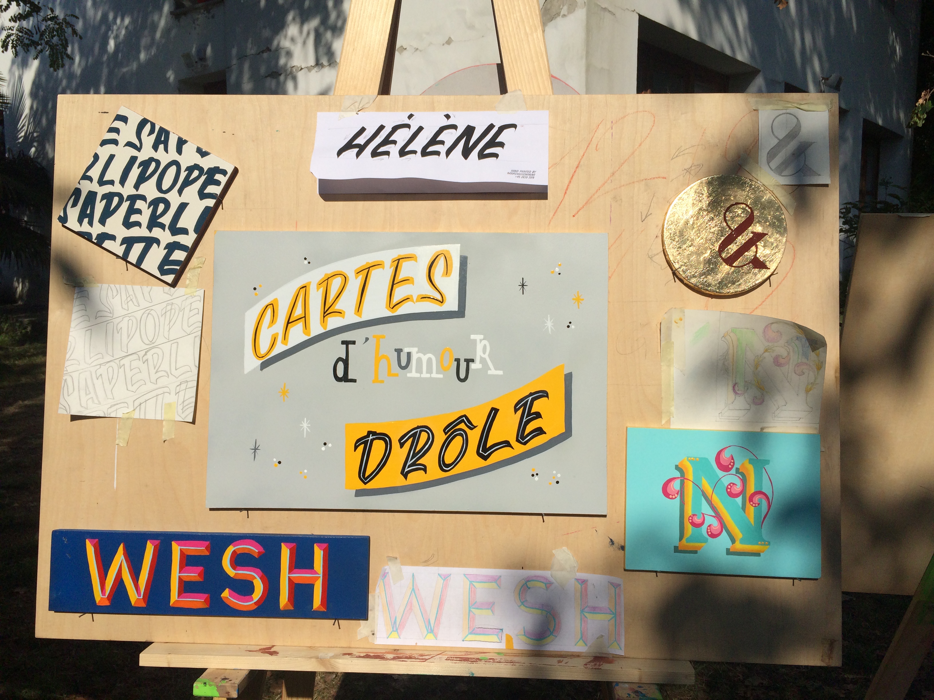
Fridays are usually the most “stressful” days of the workshops. We needed to finish the fonts/signs for Saturday’s exhibition. Some of the participants were super productive and managed to work on more than 1 sign.


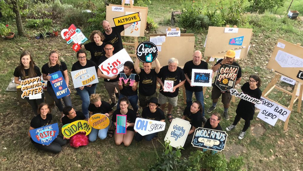
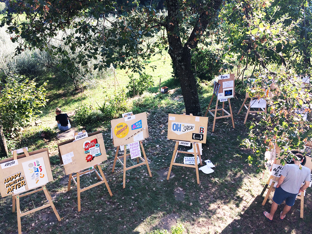
Day 6 – Exhibition
In the morning we had some time to finish the signs or to explore new painting techniques.

But the afternoon was reserved for the exhibition.
There has been few weeks since the workshop. Memories are still very alive. As organizer and participant, I can only say I am very grateful for the whole week. We learned a lot and got super inspired. We are getting emails from the participants, being thankful for the whole experience and sharing their post-workshop lettering and painted signs.
For me personally, this is the biggest reason for organizing type related workshops. To encourage people to explore different technics within the world of typography – and make them enjoy it!
