Sign Painting Workshop
Tipo Brda summer Sign Painting workshop with guest mentor Copenhagen Sings.
As part of Tipo Brda organization I (and Krista) organized 32th typography workshop. Since organizational part was up on us, we decided to invite Jakob (Copenhagen Signs) as guest mentor. Our wish was to make a bit different workshop this time. Normaly we held type design workshops, but since we are daily sited infront of our computers, inside of offices we wanted to have a workshop without computers – working with hand, brushes and ink only. Sounds good? It was more then good!
I had a chance to paint three signs. All three somehow represent me.
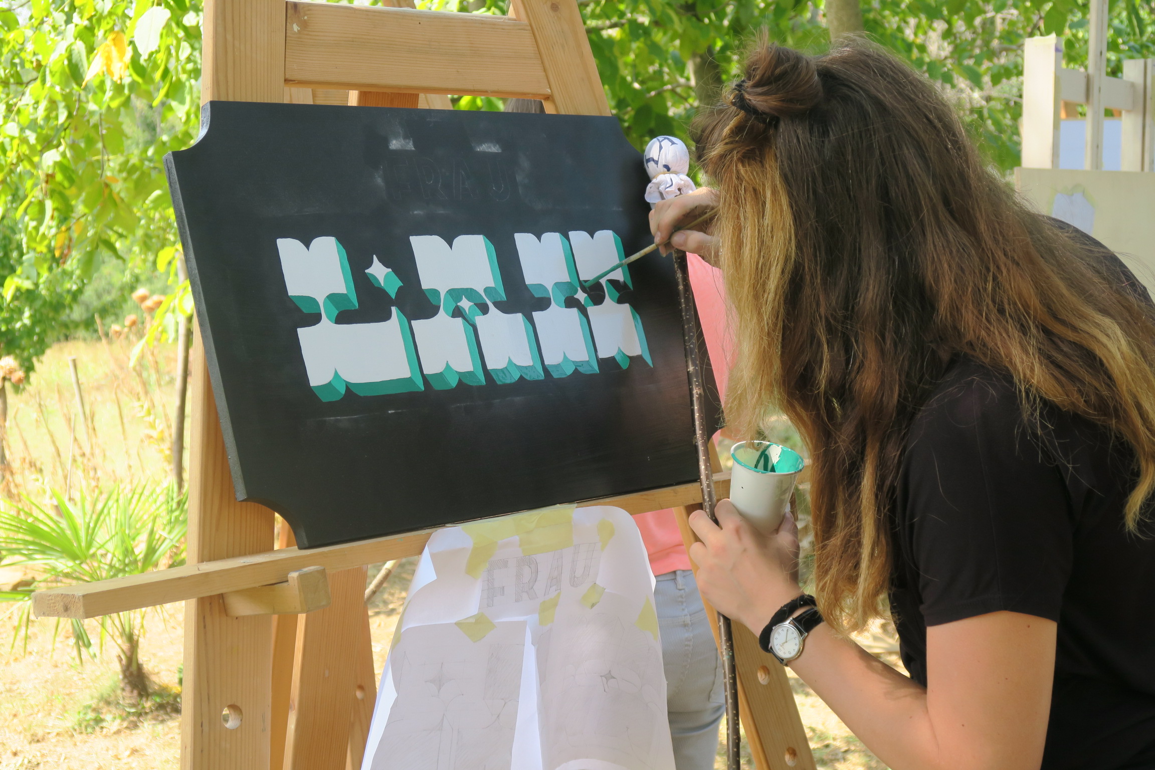
SIGN I
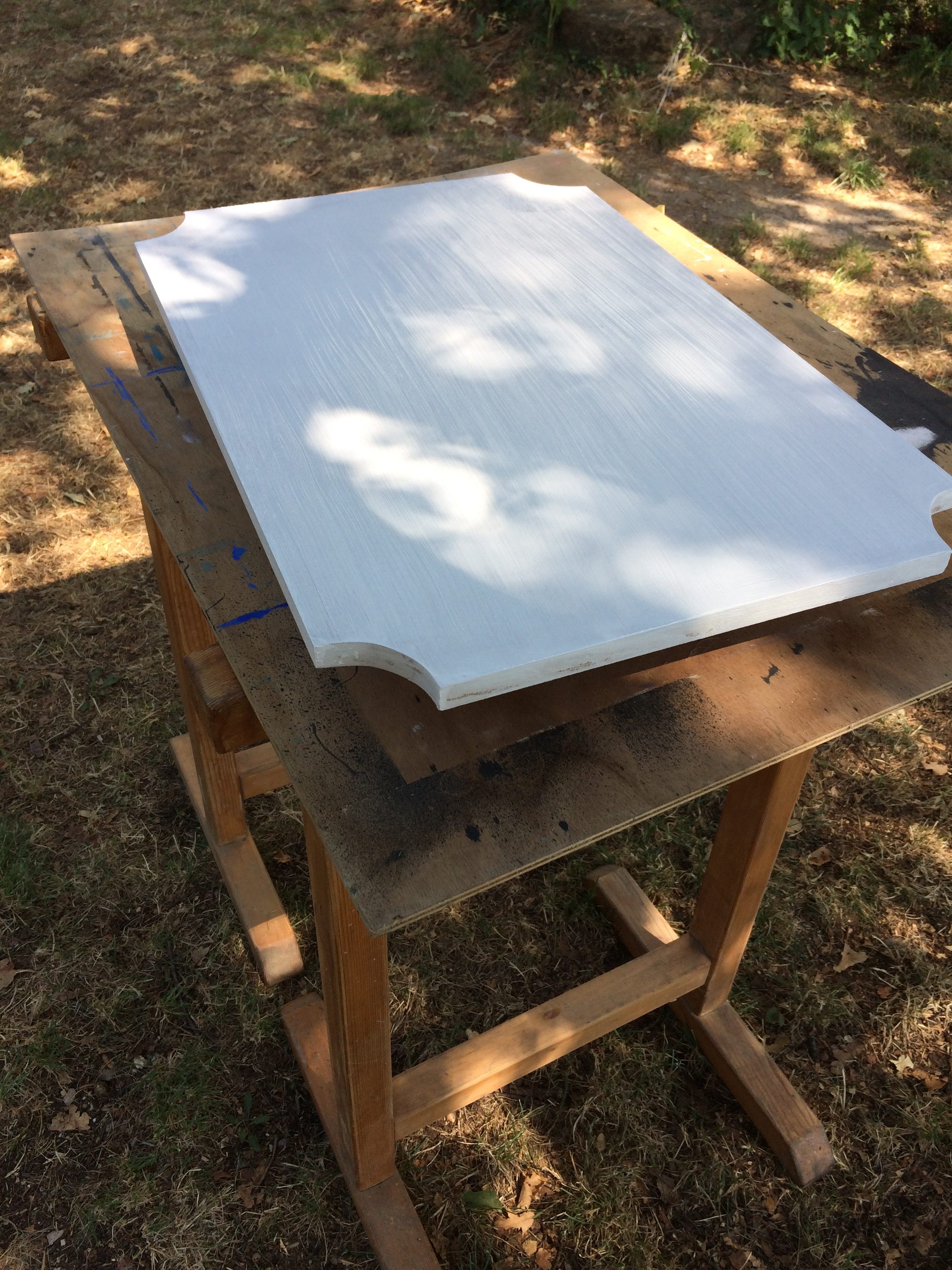
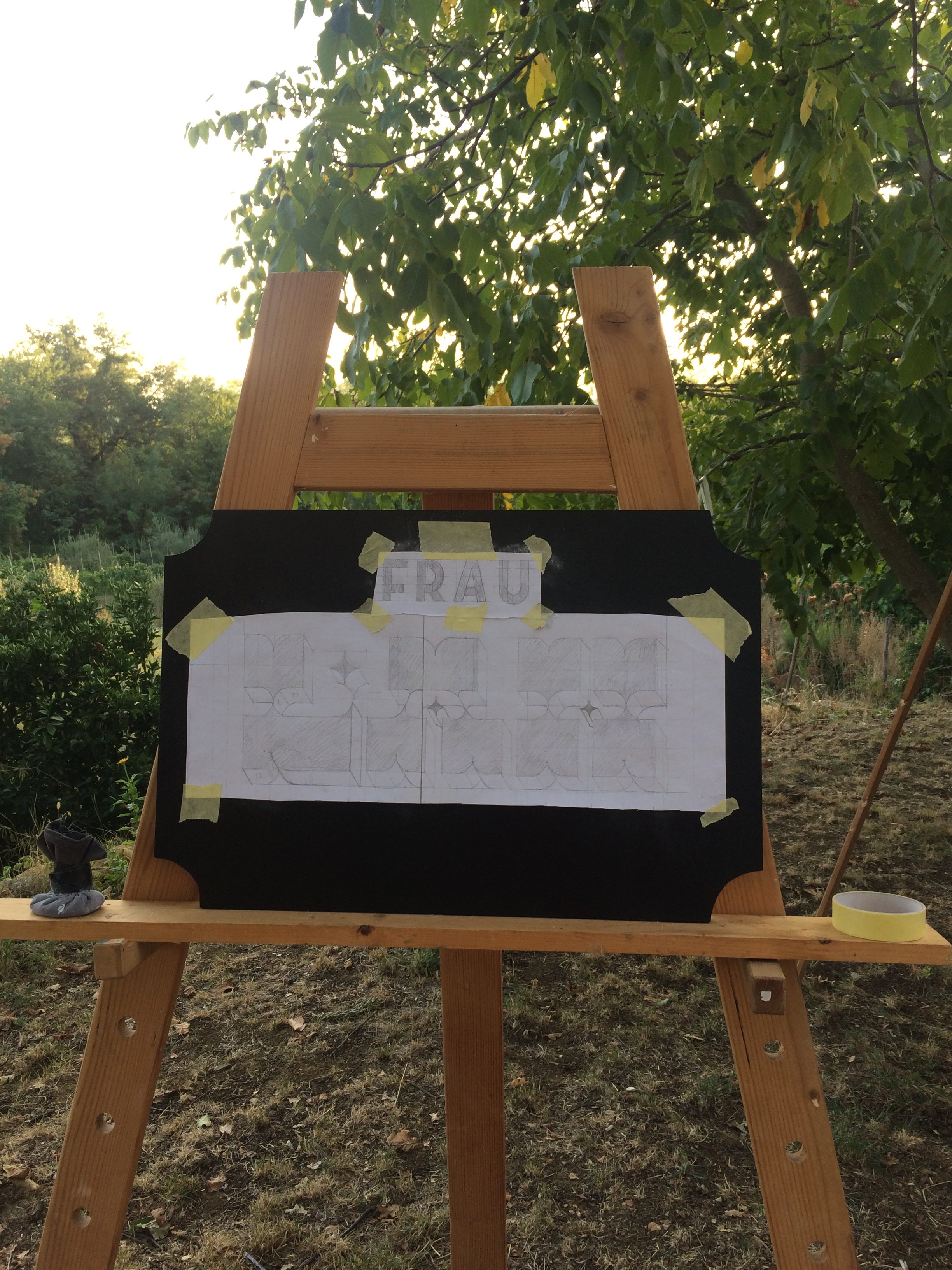
My surname is Herlah. It sounds a bit German, specially when it is divided in two parts: Herr (Mr) + Lah. Since I am not Mr, but Miss (Frau) I came up with wordplay = Frau Lah. Signs with reversed contrast always grab my intention. It is somehow difficult to decided either letters with reversed contrast look really nice or unacceptable. There is a thin line between those emotions they stir.
Firstly, I sketched the design on paper. Meanwhile deciding for a color combination I cut out the corners of the wooded panel. I continue with coat of white primer and when dried put on another coat of black background color. When a wooden panel was prepared for painting I transferred sketch from paper on wood and started to paint. Great support while painting was mahlstick, which we made by ourselves.

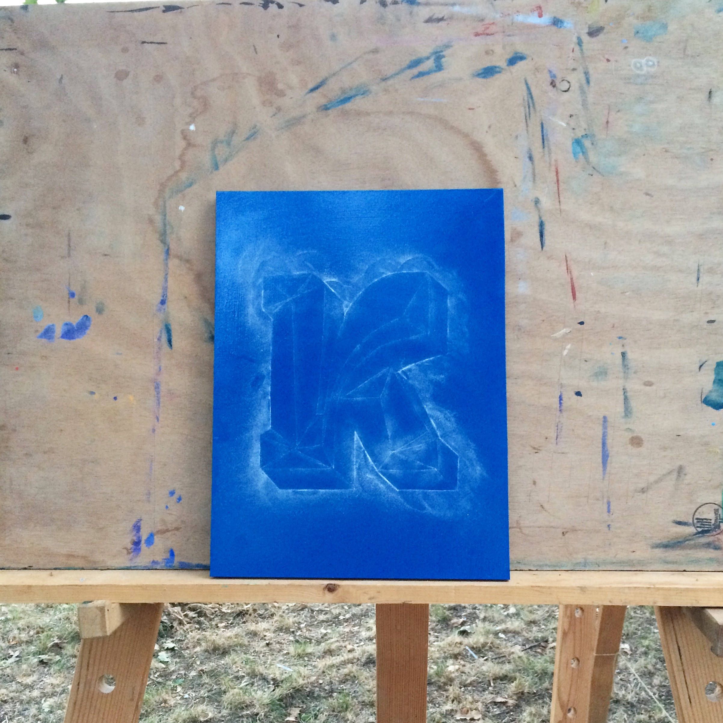
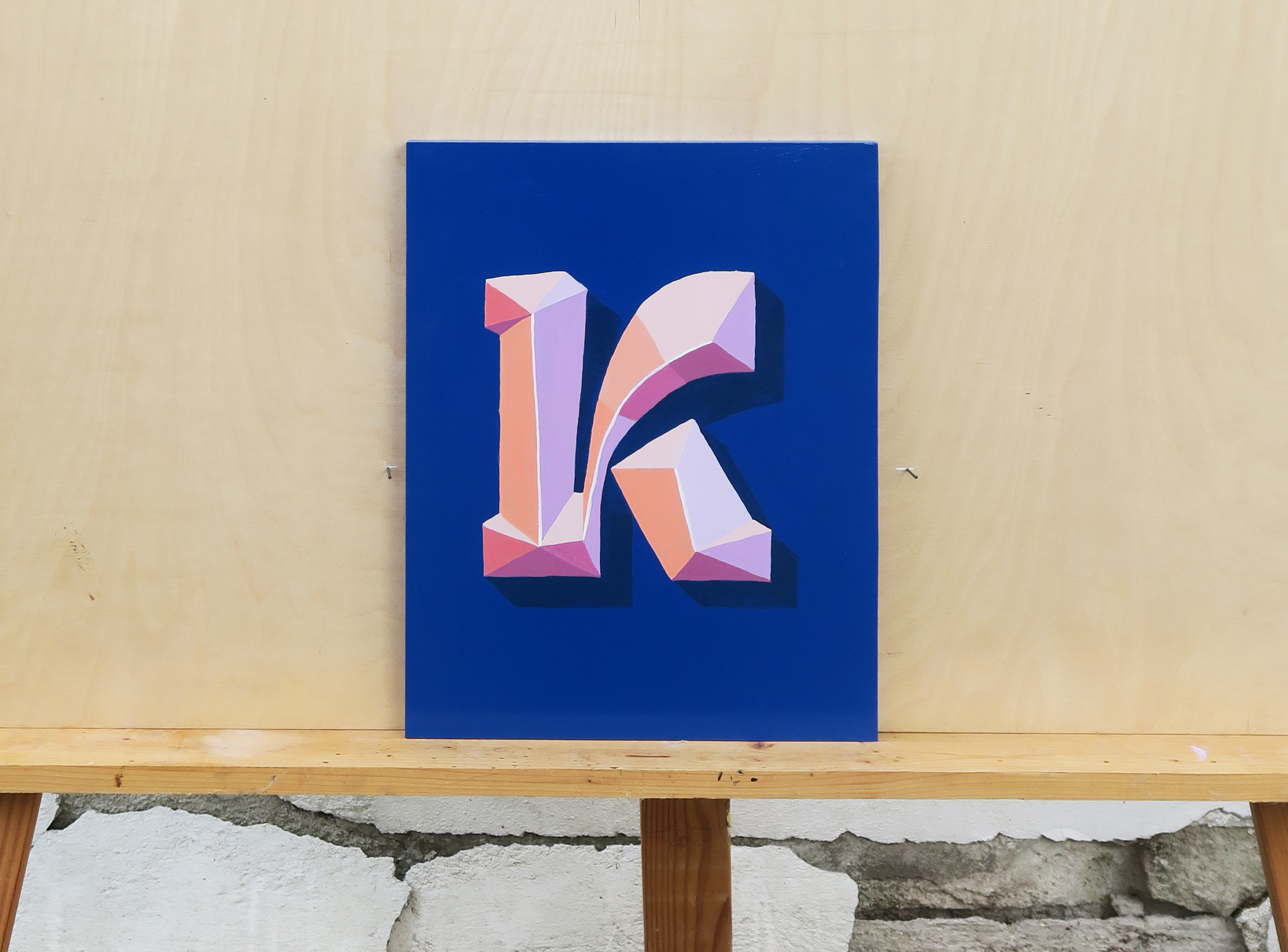
SIGN II
With sign two I decided to represent one of my own type designs – letter K from typeface Alica. While designing typeface I had a lot of fun, researching and playing with ink traps. I produced a big amount of alternate characters so here is the one of my favorite. Uppercase K.

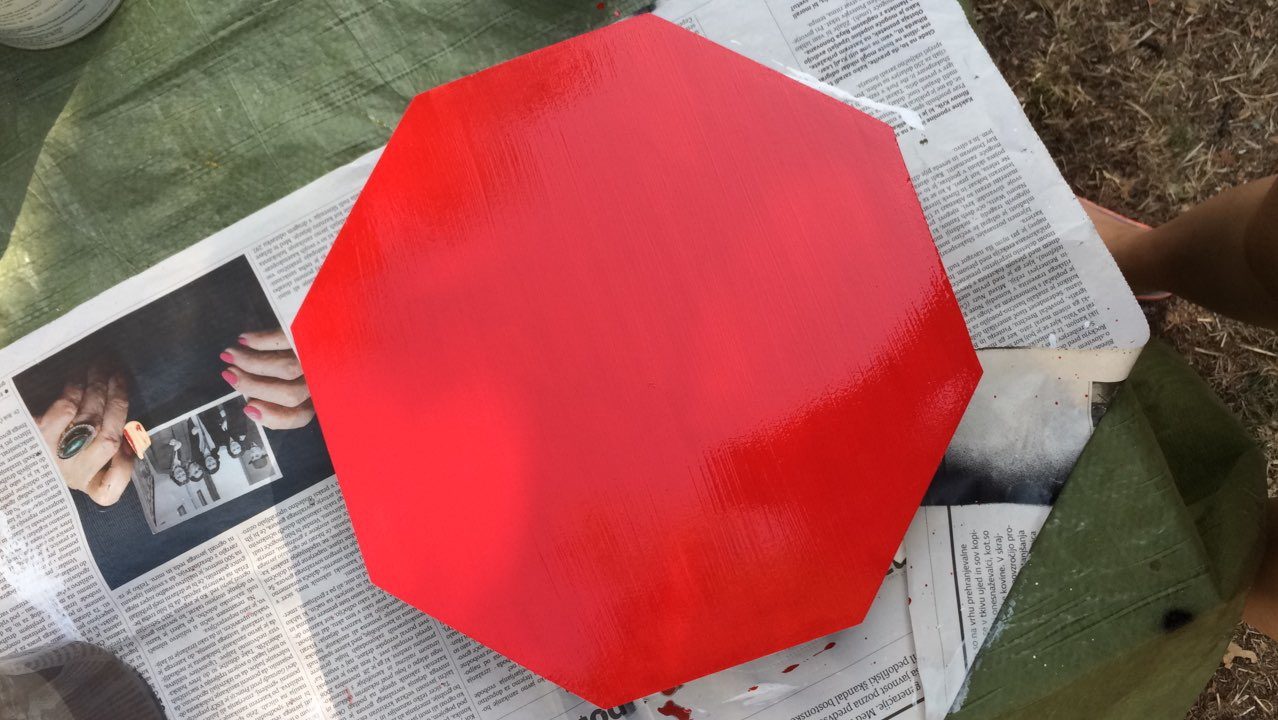
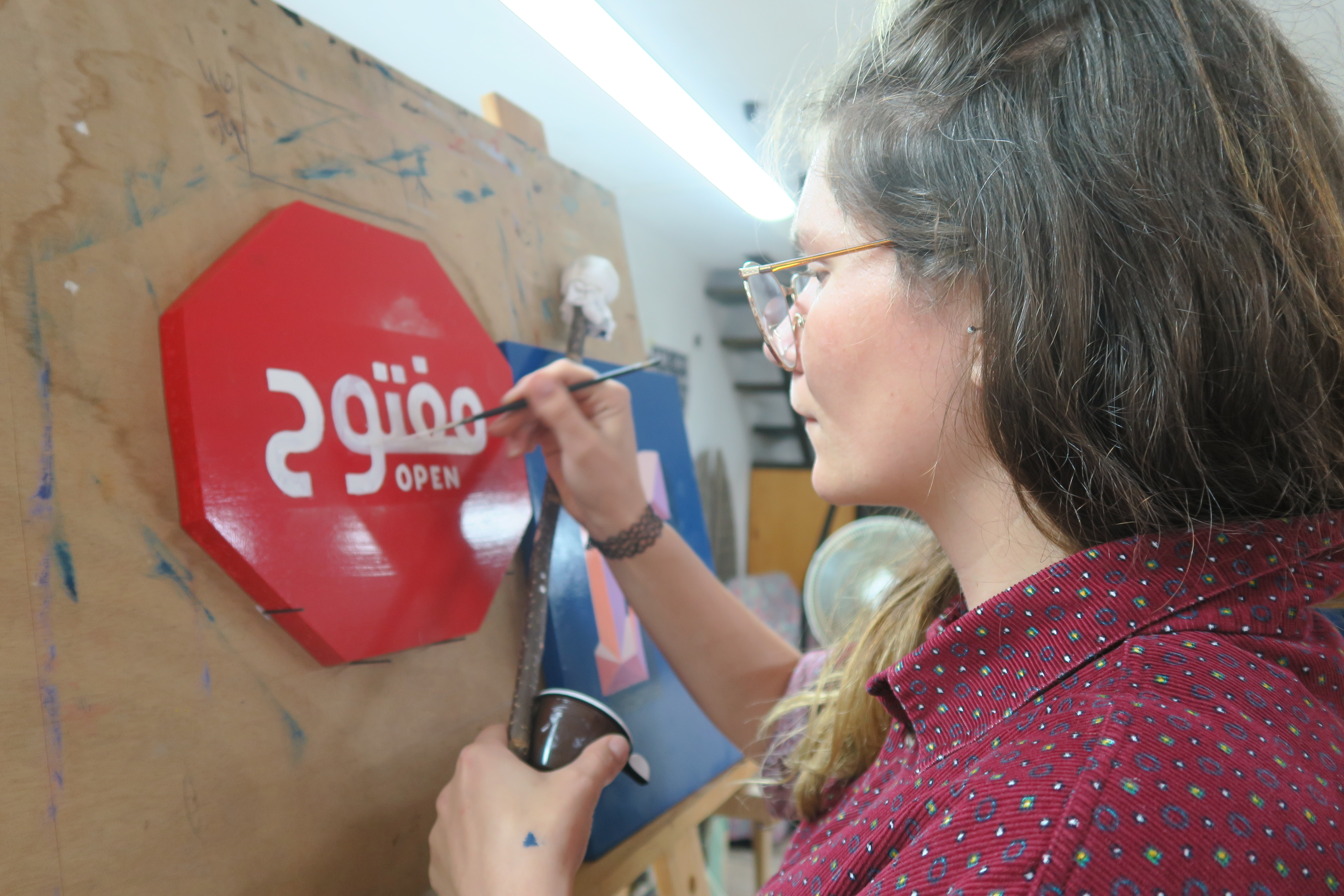
SIGN III
Past year, I got an opportunity for designing Arabic typeface. My interest in Arabic letters is increasing daily. There is great mysteriousness and richness hiding behind Arabic letters. I believe also media is contributing to my interest … While traveling in Jordan I realized that even though I am not able to read Arabic I could understand the meaning of the stop sign because of its reconisable shape. I cut out octagon and coated it on red. Painting stop on so recognizable shape seemed too easy. I wanted to poke into our heads. So instead of painting stop I paint open in Arabic. If there would be only Arabic word, most of people wouldn’t recognize the meaning so I added open in Latin as well. The sign represents todays attitude of west world towards Arabs and refugees. Saying open but thinking stop.