In the past years, many Slovenia national companies were closed down due to political, financial, … reasons. I decided to dig through archives and bring those signs and logotypes back to life. I notice each of them still brings various emotions. I will digitise them and go through personal, typographic & contemporary retouching.
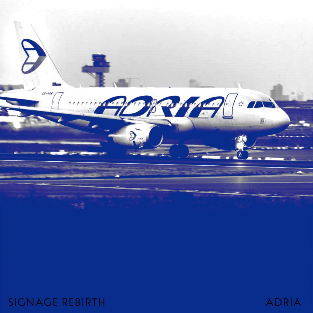
Firstly, there is a logotype I redesigned a few years ago at the time Adria Airwaves finished operating which brought a lot of agony for travelling from/to Slovenia. The thickening of the strokes from the old logotype was not balanced, there I focused on unifying the contrast.
Nama (Narodni magazin) or national store was one of the first Slovenian department stores. This sign was used in the 60s and has been redesigned several times. I digitized the neon sign and added a slight retouch. Can you find it? :)
Photos were found on FB: Stare fotografije in razglednice Ljubljane.
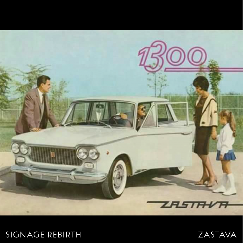
ZASTAVA was an iconic Yugoslavian car manufacturer. I believe this version of the logo is one the earliest, used in the 50s. Digitized letters stick together which gives them a feeling of movement. Instead of sharp, squarish corners I refined them into rounded ones and added a softer touch.
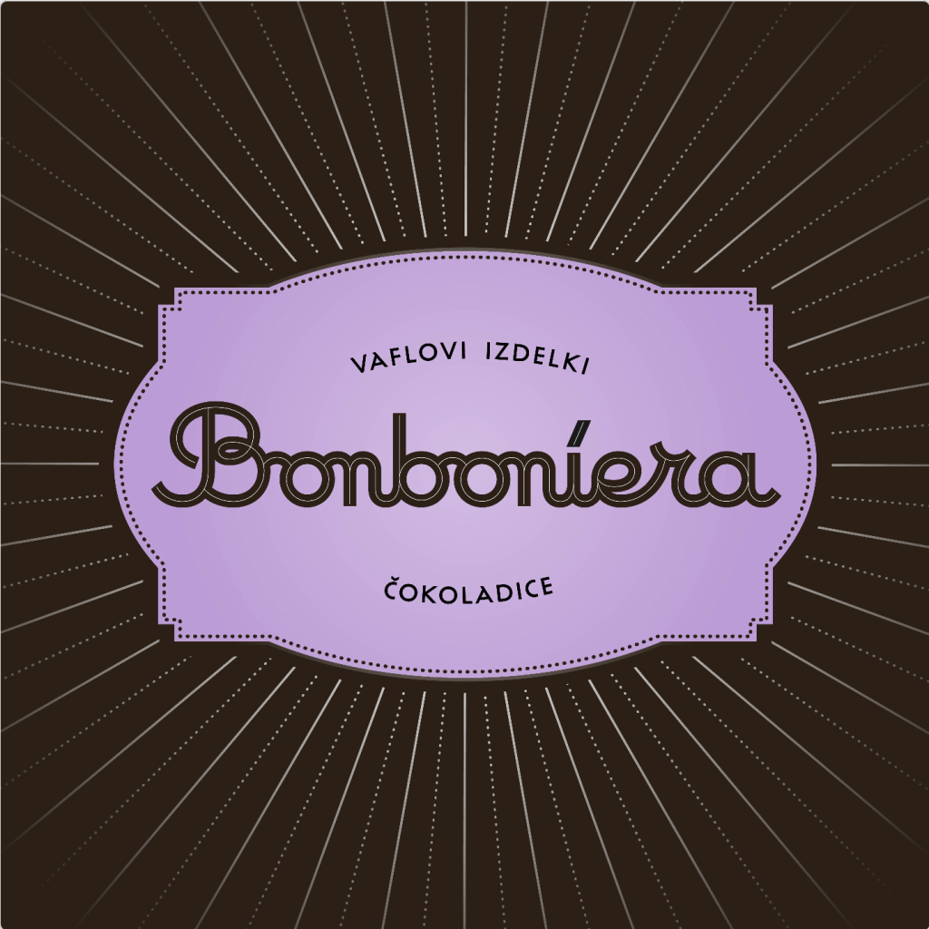
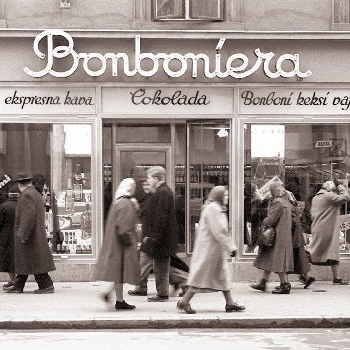
Such a nice sign from the northern part of Ljubljana. The shop used to sell chocolate and sweets, therefore the lettering is curvy, soft and delicious.
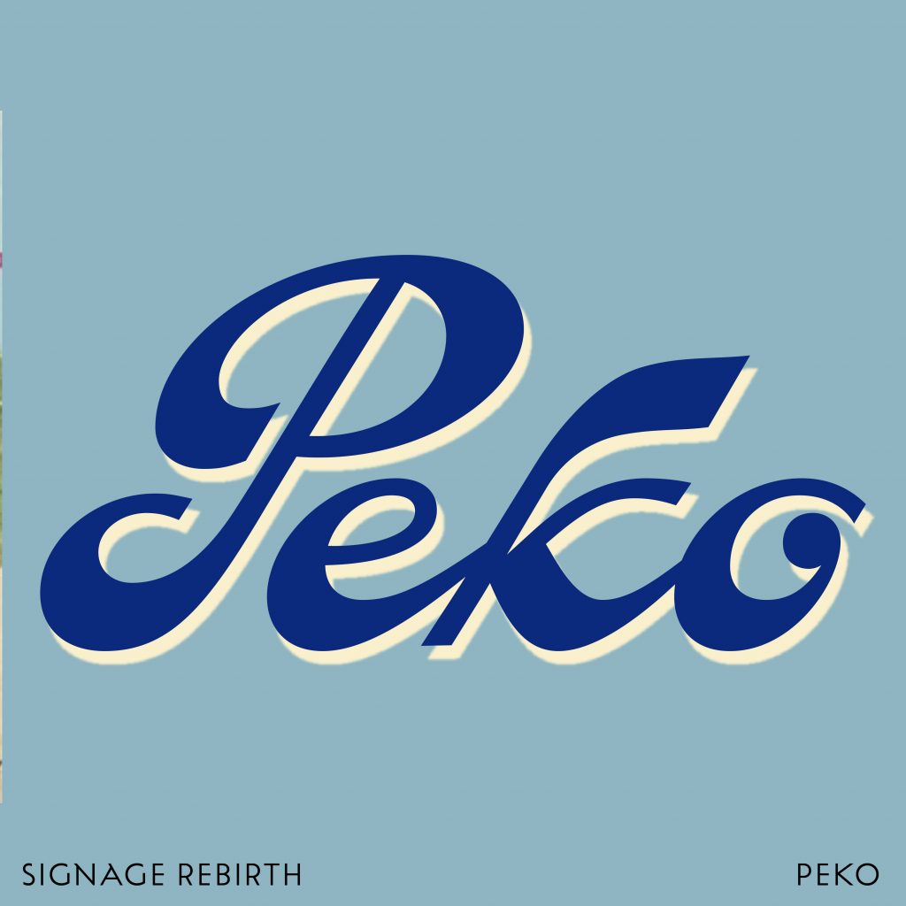
PEKO (Peter Kozina) was one of the first Slovenian footwear manufacturers, established at the beginning of the 20th century. The logo has been redesigned a couple of times but those funky, brushy shapes are definitely still in our heads. I refined the contrast to the point where the logo is still recognizable.
The photo is from www.dlib.si (NUK)
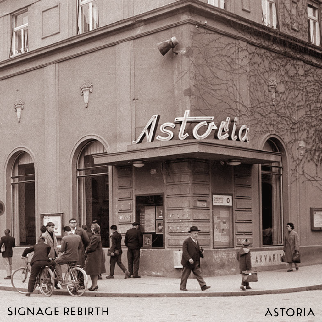
One of the nicest signs, still in use – ASTORIA, a coffee house in Maribor. 2nd photo is dated back to 1960. There is also the Slovenian movie Cafe Astoria, named after this place and set in the city of Maribor before the Second World.
I made small refinements to the letters and put special attention to the letter S in order to fit better within the group of letters.
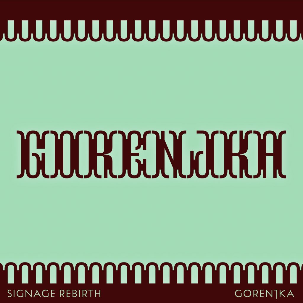
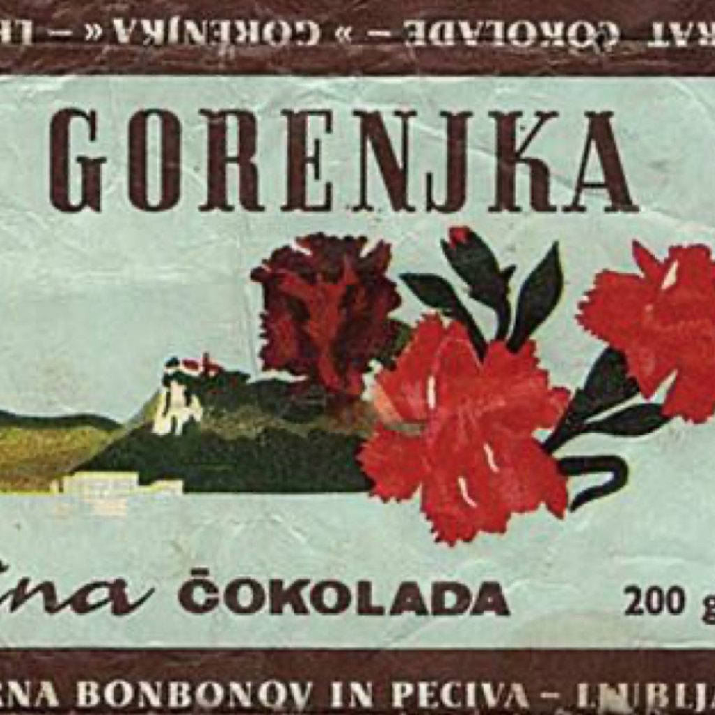
Gorenjka is delicious Slovenian chocolate with long tradition. I found this packaging that is not in use anymore but is usig such nice serif uppercase. I must admit I went step further with this logotype, it really let me explore expressiveness of the shapes and push them a bit further from expected.
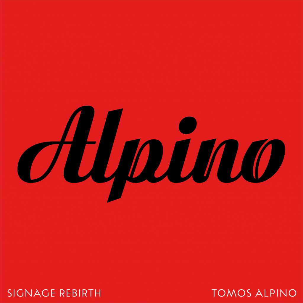
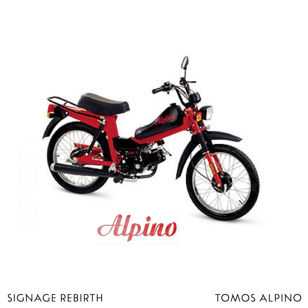
This one is for all Tomos lovers. Alpino is one of Tomos products. TO-Tovarna, MO-motorjev, S-Sežana was a Slovenian moped manufacturer. Lettering from the Alpino series has a nice ink traps feature, which immediately caught my eye. I applied ink trap from letter n on other letters and refined the script-y curves.
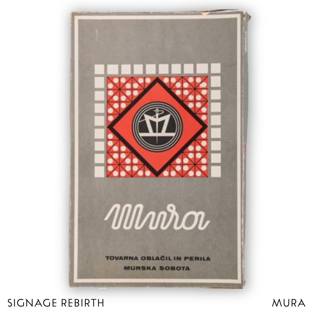
Mura was founded in 1925 in Murska Sobota and used to be one of the biggest EU producers of top men’s and women’s fashion clothes. Once, as the times were different … I believe this version of their logo is one of the earliest.
Packaging photo from: http://museu.ms.
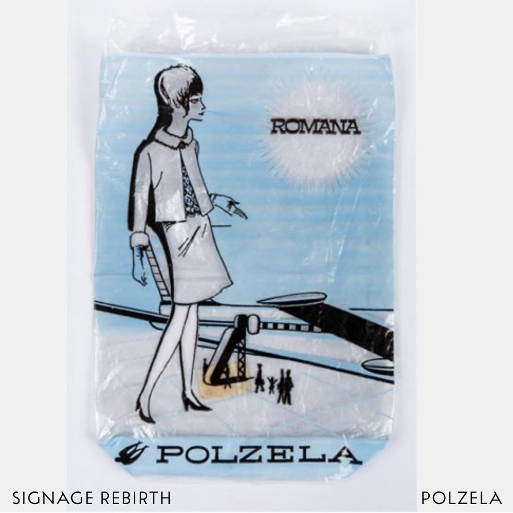
Polzela, founded in 1927 was producing tights, socks, and leggings. packaging. I increased the contrast of the thickening of the strokes and thus emphasized the inverted contrast, which is a recognizable element of the monospaced letters of the logo.
Photo from: http://museu.ms.
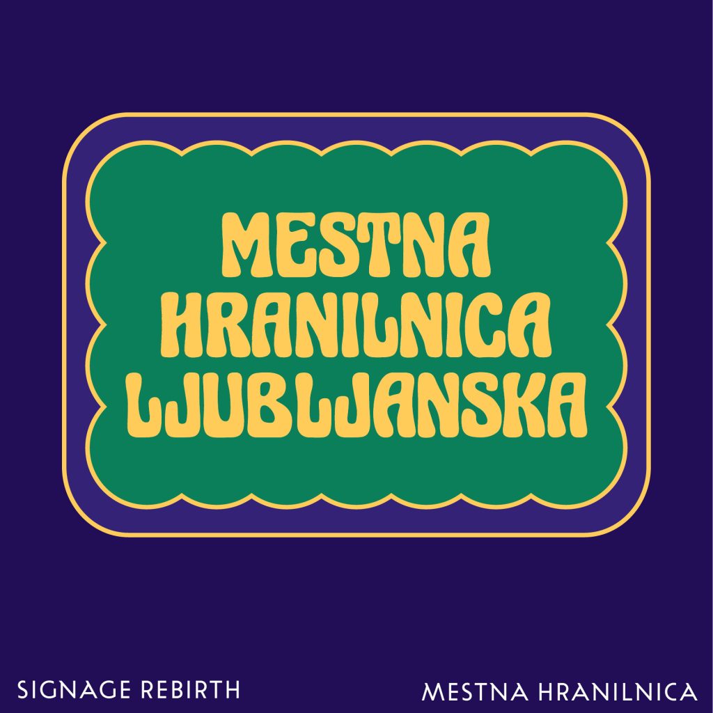
Mestna hranilnica Ljubljanska – one of the first Slovenian financial institutions – was located in a building renowned for its Secession façade, highlighted by a glass and wrought iron canopy. Above the entrance, the original Secession sign structure remains, though the lettering has sadly changed over the years. Here is my contribution to Secession letters, adding a slight variations in repeating letters.
Photo from wiki.
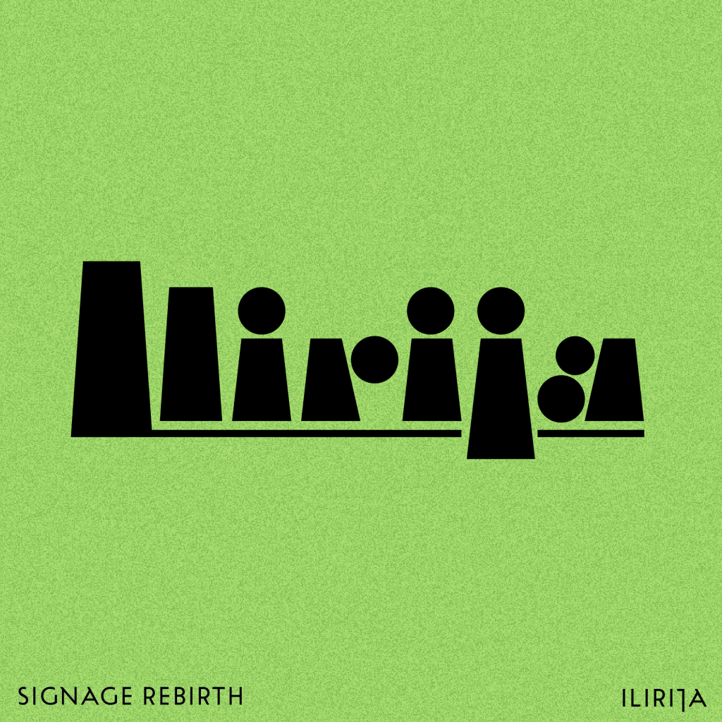
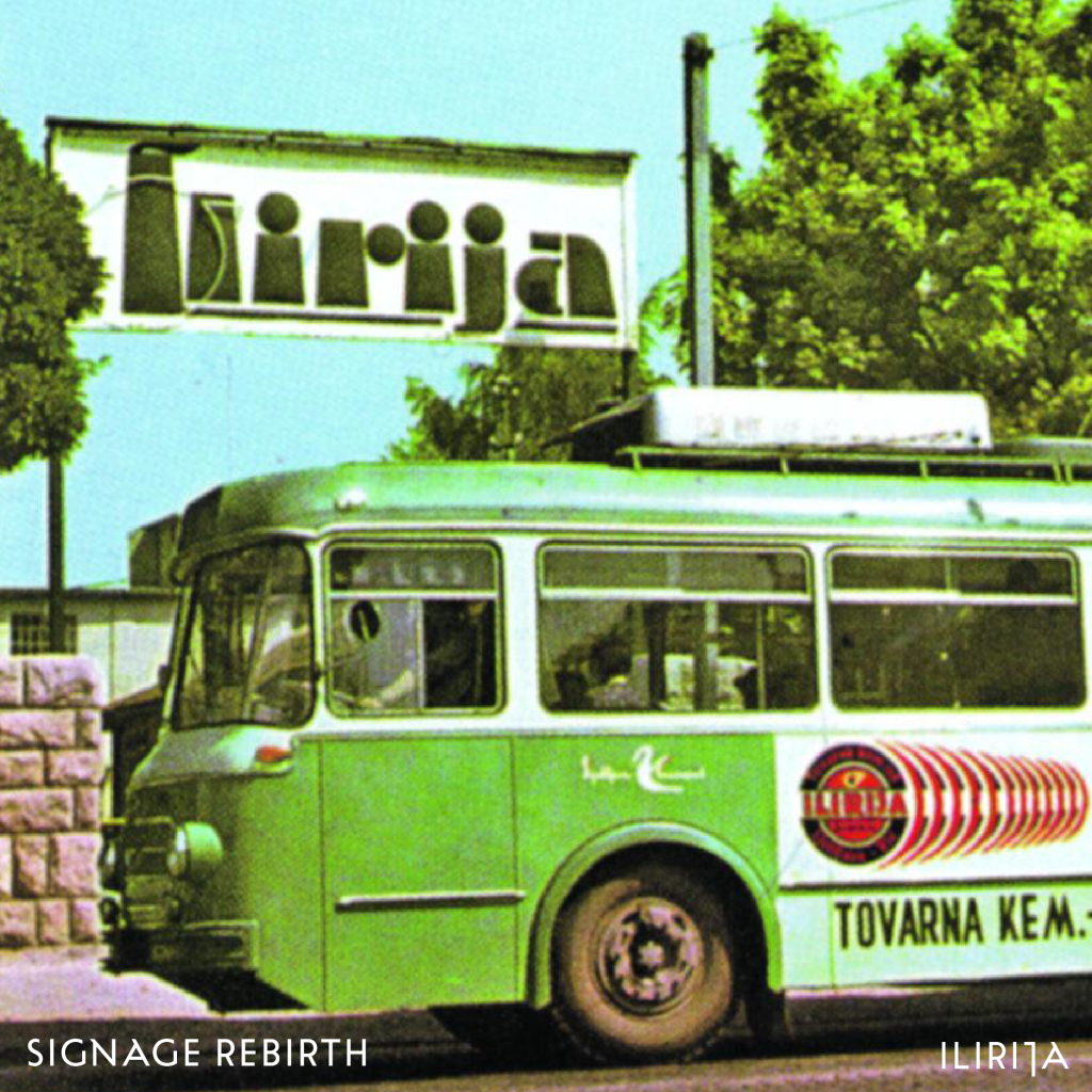
Logotype Ilirija was used for shoe cream products. It was founded in 1908 as the Chemical Products Factory Golob & Ko (Franc Golob and August Volk). I redrew letter shapes and did a few fine refinements in order to have more consistency.
Photo is from fb: Stare fotografije in razglednice Ljubljane