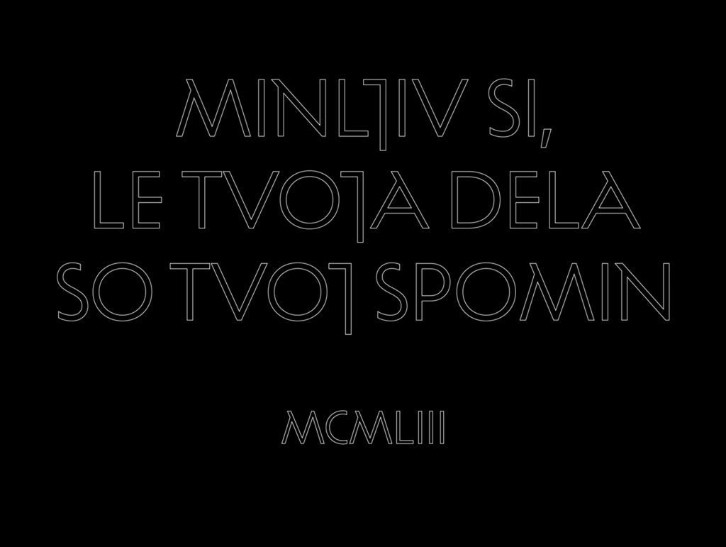
PLECNIK – typeface based on handwritten lettering by Jože Plečnik
The most famous Slovenian architect is largely known for his architectural works, but less so for his contribution to Slovenian typography. Plečnik did not only design the typography for many inscriptions on tombstones, monuments and façades, but also the graphical image of various printed materials. The typeface that was created is not a digitalisation of his sketches, but rather a reflection of the current state of design whose starting point is rooted in the principles and forms of Plečnik’s letters. Furthermore, the process of defining and developing the typeface was based on a detailed research of Plečnik’s life, his work and his teaching principles.
DESIGN PROCESS
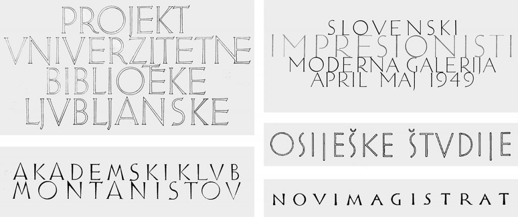
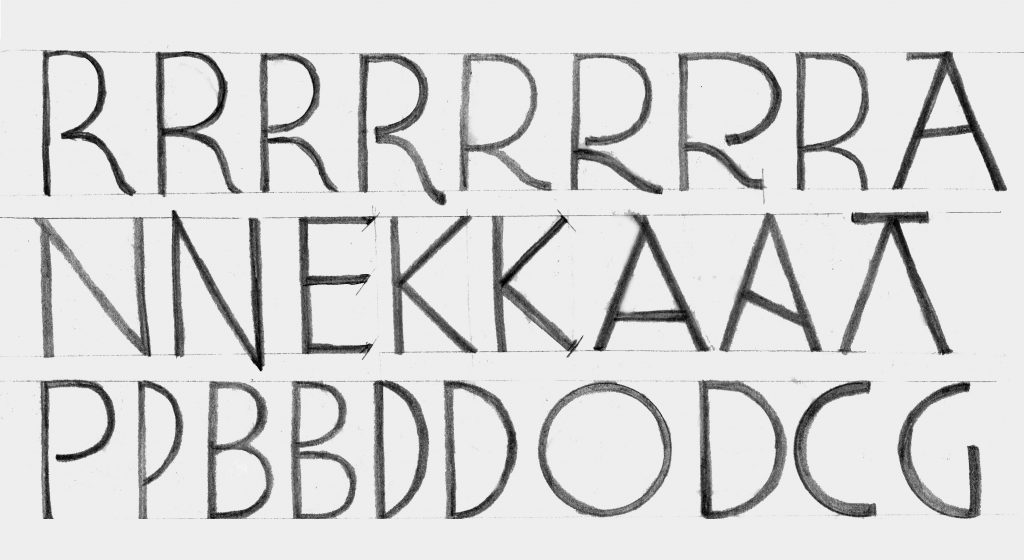
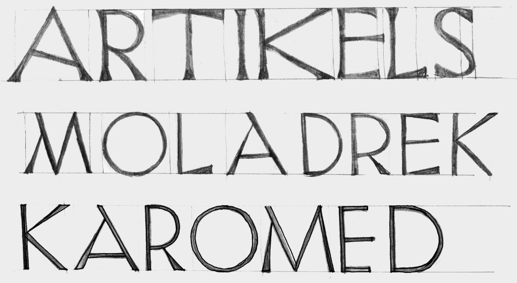
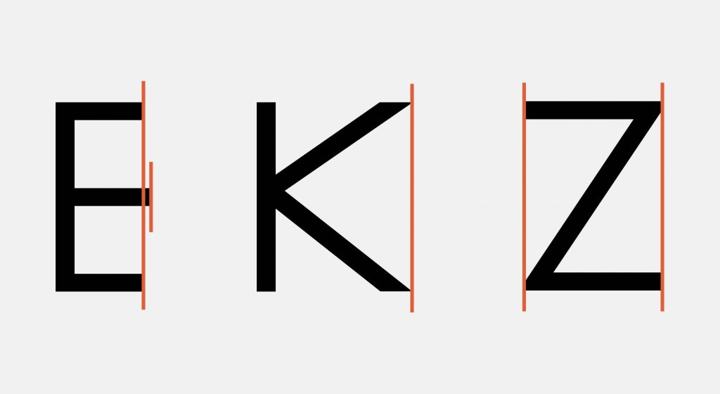
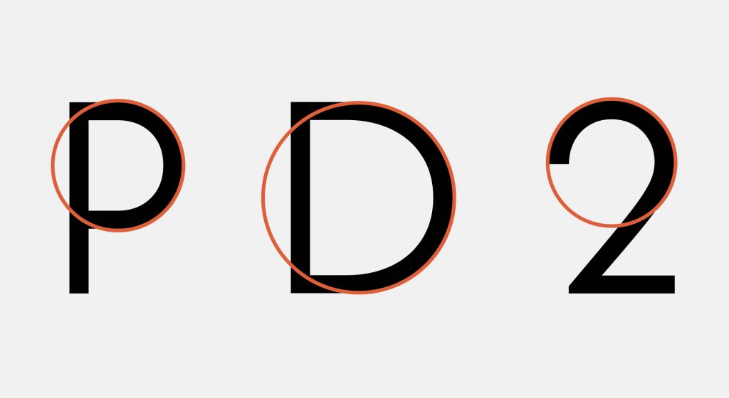
The process of developing the typeface began with a research of the archival material at the Plečnik House. The letterforms we obtained from the archives served as an inspiration for the sketches and parameters of the typeface, while recognisable forms and details helped to design a unique typeface. The features show development of digitized letter forms that are based on the sketches. The presented details define the entire Plecnik typeface. The middle horizontal stroke of the letter E is slightly extended on right. The diagonals of the letter K meet in a vertical stroke. The recognizable characteristic of the letter M in the upper left part is repeated in Plečnik’s sketches and used in Plecnik character set. The upper circle of the letter S indicates a recognizable Art Nouveau organic element.
FEATURES
The features show development of digitized letter forms that are based on the sketches. The presented details define the entire Plecnik typeface. The middle horizontal stroke of the letter E is slightly extended on right. The diagonals of the letter K meet in a vertical stroke. The recognizable characteristic of the letter M in the upper left part is repeated in Plečnik’s sketches and used in Plecnik character set.
STYLE
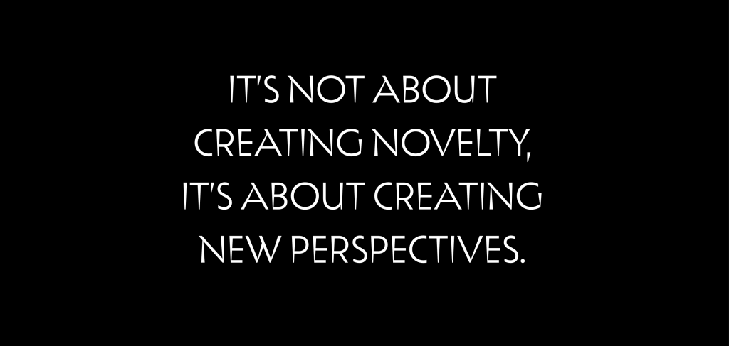
The style of the Regular style is a geometric sans, with no noticeable increase in the width of strokes. The forms originate from traditional principles of Classicism that show a respect for tradition. These characteristics serve as the foundation on top of which new forms are built, which in turn are used as the foundation for the Display style.
The idea for the Display style comes from Plečnik’s columns that grow wider from the bottom up – the so-called increase in diameter along the height of the column. This principle is expressed several times in the sketches of letters and was the reason for the Display style, which is even more distinctive and perhaps even more attributable to Plečnik.
Plečnik planned his projects in a comprehensive and thorough way from the initial architectural plan right down to the final details on the building – even inscriptions followed the main concept and therefore contributed to a carefully considered whole. Letter designs and ornaments, initials, inscriptions on monuments and tombstones, ex-libris, book covers, line breaks, plan designs – these are all part of Plečnik’s rich opus and have had a great impact on the overall image of Slovenian typography. All of the above is yet another aspect of Plečnik’s contribution to the Slovenian heritage and, indeed, the modern image of Slovenian identity, which emphasises the carefully considered, comprehensive and progressive.
Test font, read more or download it here: https://type-salon.com/plecnik-en/