Master’s thesis: Theory of the Stroke in Designing Non-Latin Typefaces
Abstract:
One of the results of globalisation of our world is increasing awareness of other cultures, which can be noticed in visual communications as well. In the past decade, there has been an increase of extended multilingual typeface families, which also include non-Latin typefaces. As a result of multilingualism, we come into contact with more than one language in our everyday lives – in signage, packaging, and dictionaries. When setting more scripts together in text, typefaces should be visually balanced, even though the scripts are different. Designing typefaces for a global world implies taking into consideration cultural diversity and the variety of different writing systems. We have to consider that different scripts were developed in different environments. The letter shapes as we know nowadays have been significantly influenced by the history context of a particular culture.
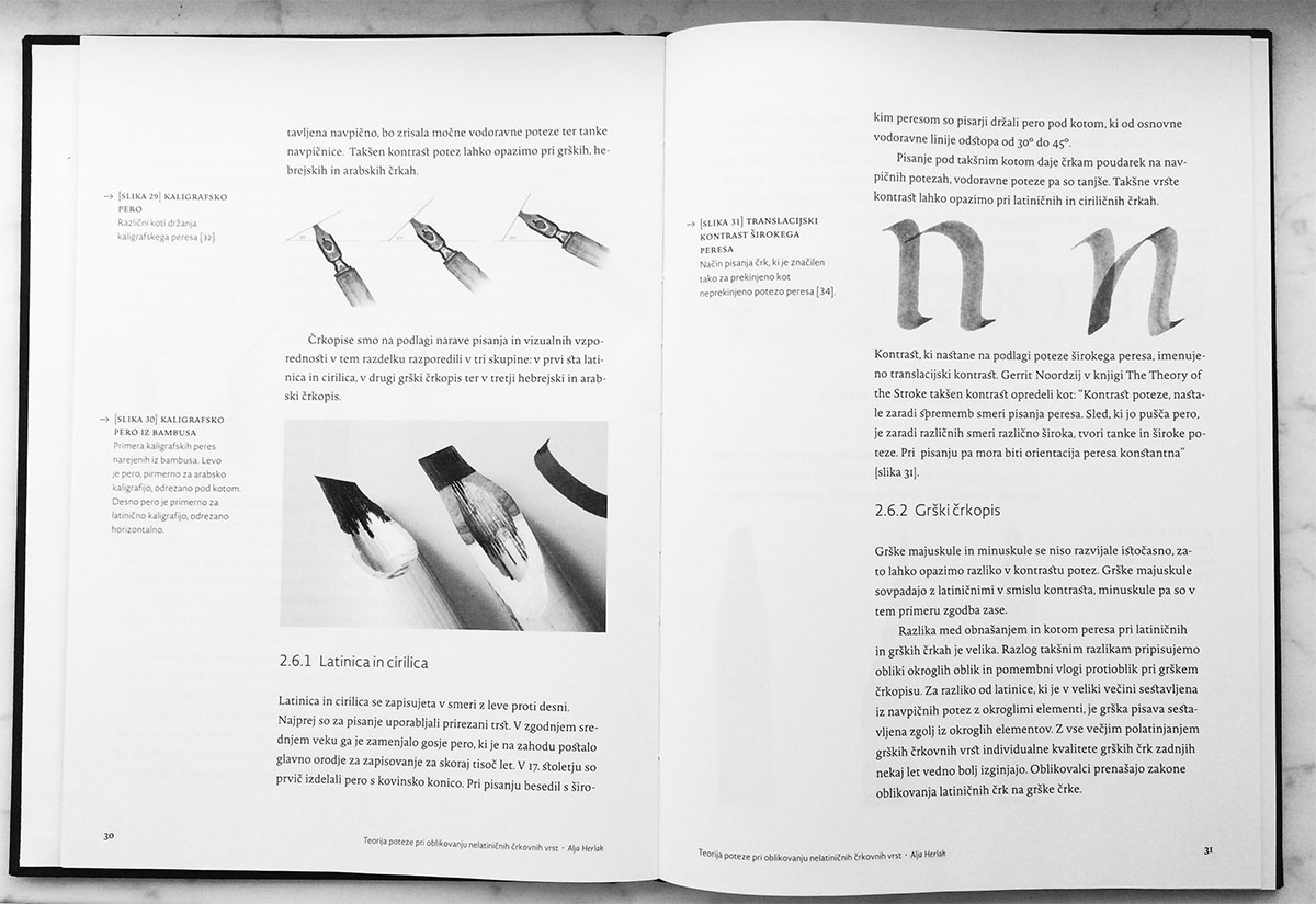
In the theory of writing, broad nib pen is our guide when designing body typeface systems. Designed strokes are based on the broad nib pen and should be harmonised through different scripts. To achieve great balance between multilingual typefaces in the family, we have to take into account how typefaces are set in longer texts. Letters and negative spaces between them create texture, rhythm, and colour of the text, which should be balanced as well.
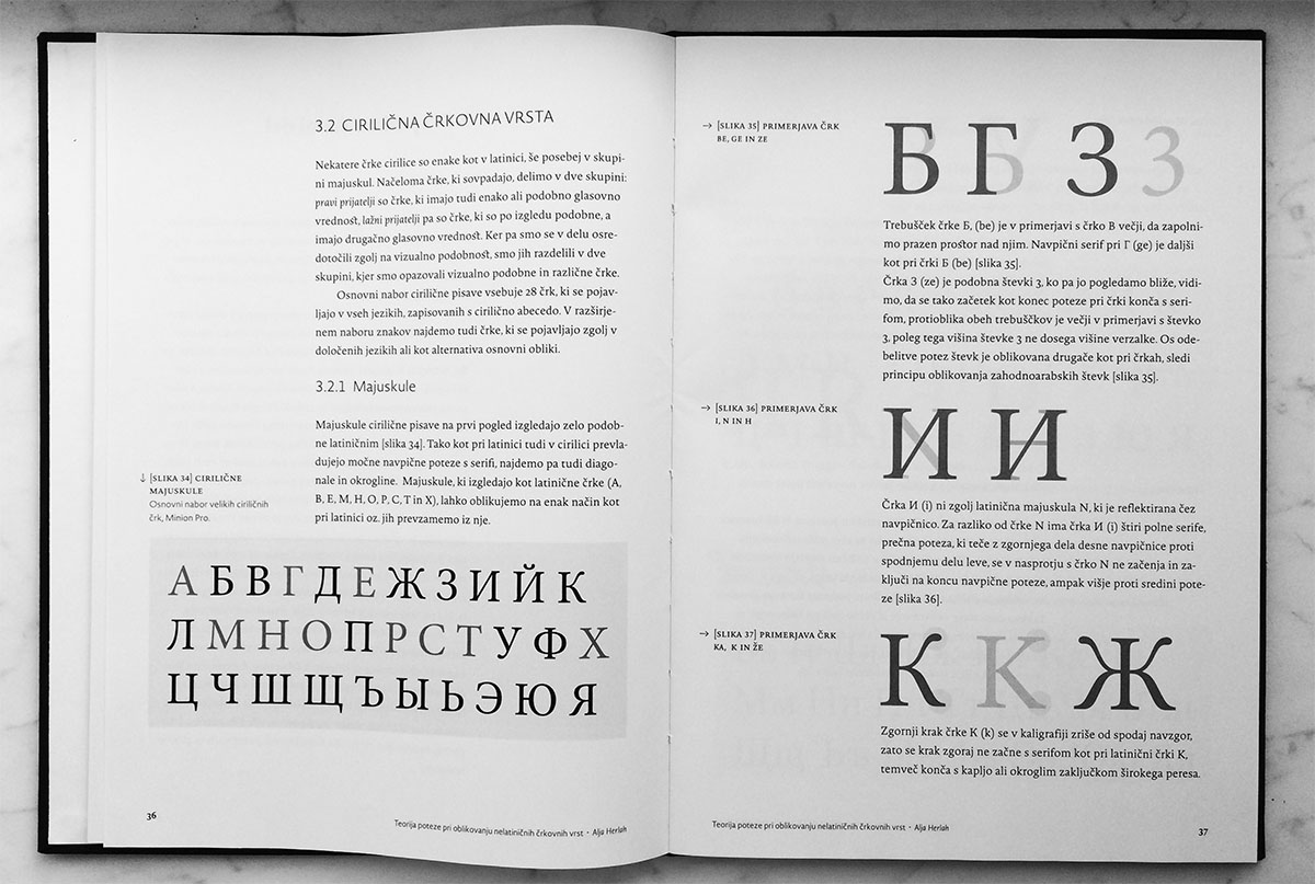
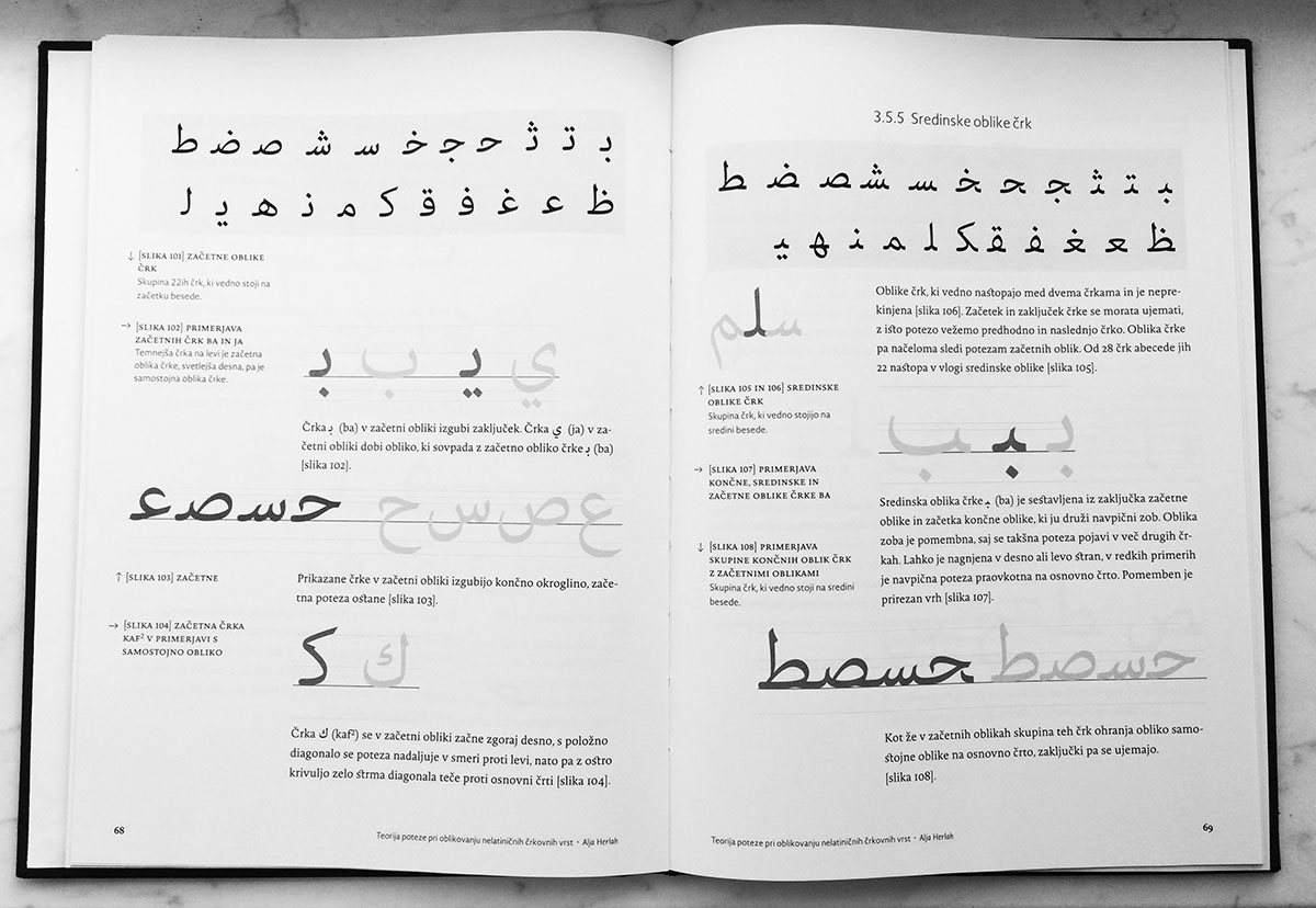
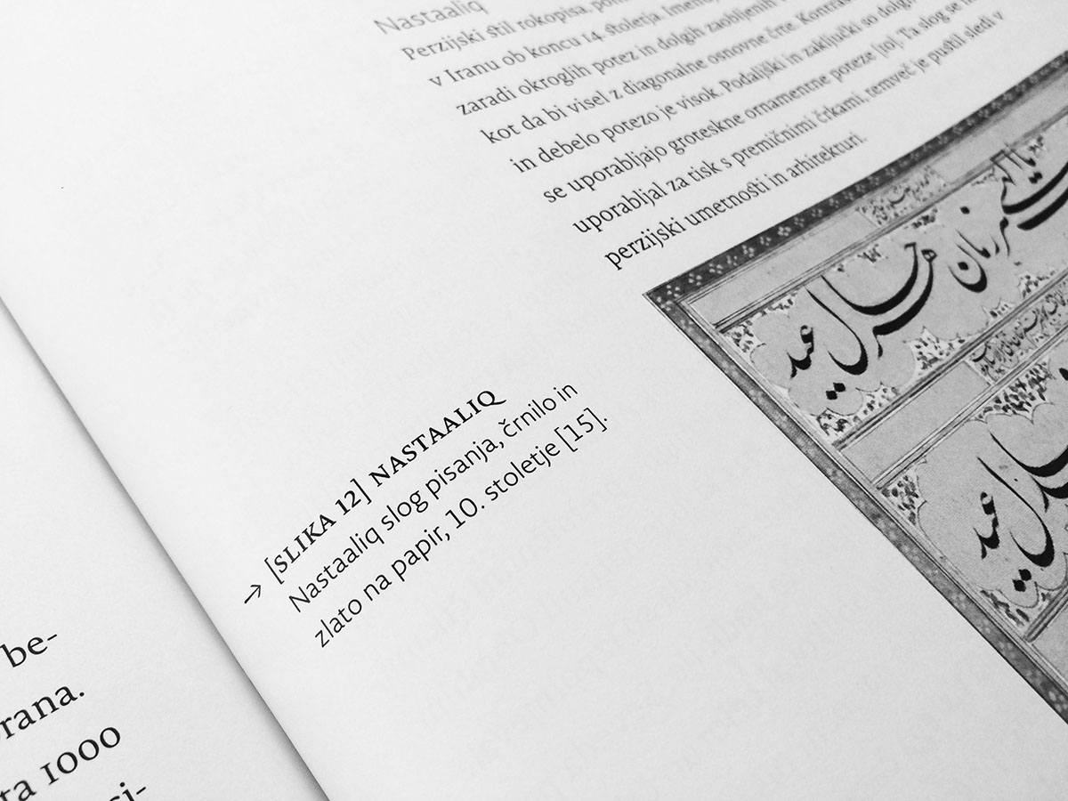
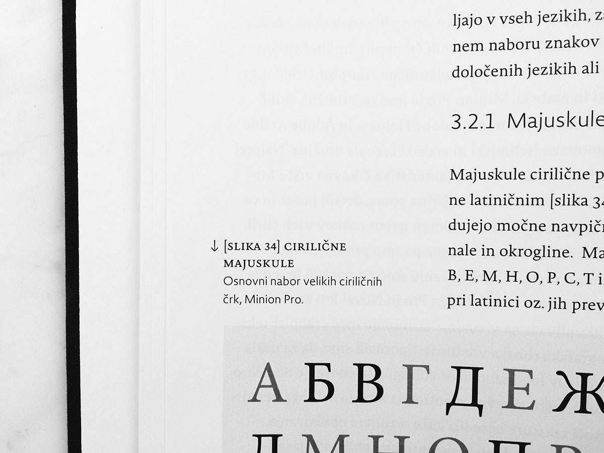
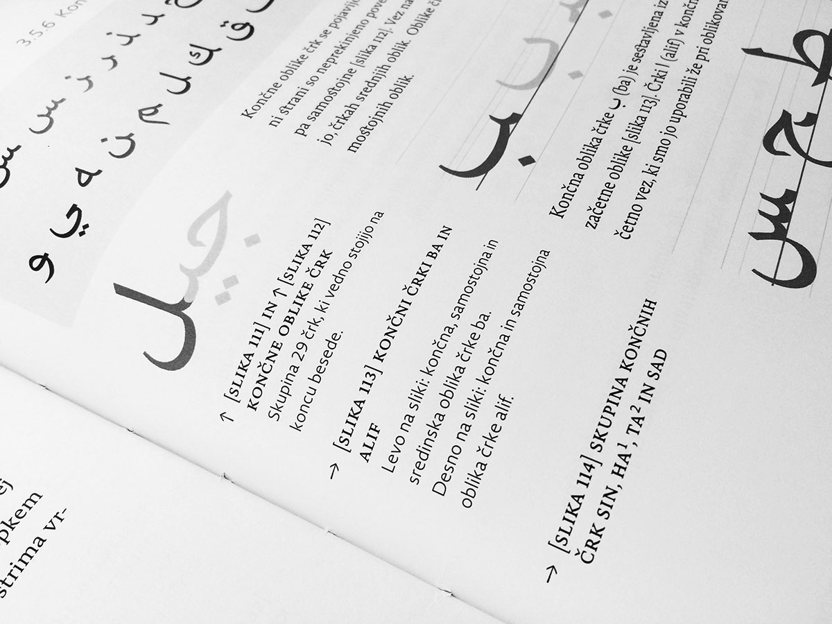
Master’s thesis uses the Theory of the stroke, – which is known for the Latin typeface design – and transfers it onto the designing of non-Latin scripts such as Cyrillic, Greek, Hebrew, and Arabic.
*I did not design the cover since design should be equal for all students at the Faculty.
