Wesna: typeface inspired by Slovenian interwar poster
is a new typeface that references the letterings of Slovenian posters and their typographic legacy. The interwar period marks an important development in Slovenian typographic guidelines that was driven by posters: at the end of World War I, Slovenia momentarily caught its first glimpse of state independence and industrial development heavily influenced the burgeoning printing and publishing industries. At the time, city posters took on an important role in public communication and became part of the public space or, so to speak, the street, by which they influenced the everyday life. Developments and innovations in printing technology made it possible to broaden the use of posters to all fields of social interaction, whether they be economic, political or cultural. Even in those days, typography was one of the main graphic elements of a poster, and as new typefaces were developed by Slovenian artists and architects, it also took on an important national aspect.
RESEARCH
The examined posters were obtained from various archives: Digital Library of Slovenia, National Gallery, MAO, books by Kordiš and Bernik, and International Poster, an online archive of posters from around the world. In order to carry out our research, we needed to define the parameters and classify posters into groups. First we excluded the posters with typefaces made by German type foundries, which means that the typography was pressed with movable type, produced in Germany. We then identified the letterforms that were drawn by Slovenian designers by hand, and, finally, examined the chosen posters to find the letters that we then used as the starting point for the design of the Wesna typeface.
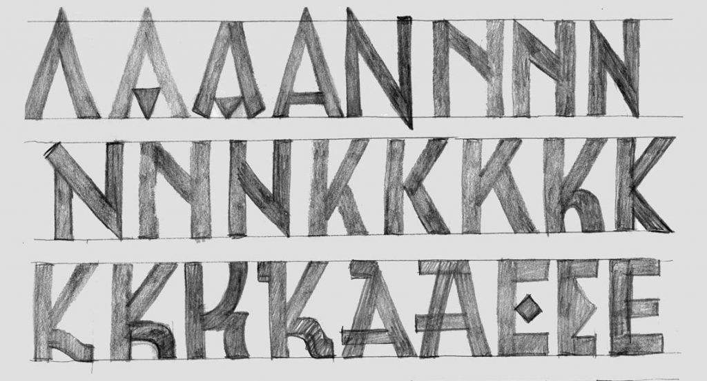
SKETCHES
The sketches were made based on the chosen posters. They reveal how the Wesna typeface was designed, as they show numerous variations of individual letters and the process of determining stylistic parameters and alternative characters.
STYLE
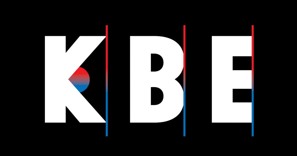
In terms of the style used, the chosen letterings are classified as early sans serif fonts, a mixture of grotesque and geometric styles. Letterforms are narrow so that more text can be used on a smaller surface. We must bear in mind that the typefaces were designed for posters, where the media format is limited. The bold features of the letters additionally reinforce the voice of the public and the way information is presented on posters.
RECOGNISABLE SHAPES
The letter A is clearly recognisable even though it lacks the horizontal line due to its narrow form. The curves of C and G close horizontally and dictate the grotesque style of the typeface. The strong personality of the typeface is also defined by the sharp contacts of the diagonal lines in A, M, N and V. The letter K features the characteristic diagonals that come together under the same angle and join at the basic stroke. The most “Slovenian” letters, Č, Š and Ž, are all the more identifiable for the caron in the geometrical shape of a triangle.
ALTERNATIVE CHARACTERS
The typefaces on the examined posters were written in hand, and show a large variety of styles and a freedom of expression which was made possible by the lithographic printing technique. The variations of some letters helped to make individual poster letterings more recognisable and diverse. It is for this reason that the Wesna typeface features a second stylistic set that is based on the primary shapes of the font, but differs in the horizontal stroke of the letters A, E, F, H and Q, where a triangle is used instead of a horizontal line.
Even though in the last few years globalisation has given the small country of Slovenia the opportunity to gain recognition and enter the larger, global market, a look back on history can be quite instructive, as the works of our predecessors can provide a source of new ideas, solutions and knowledge that help us enrich both the present and the future. Better yet, such an approach makes it possible to preserve tradition and use new technologies to promote ideas that originate in Slovenia and are reflected in Slovenian typography—that is, to preserve and spread ideas that emerged in Slovenia, regardless of how exquisite they are.
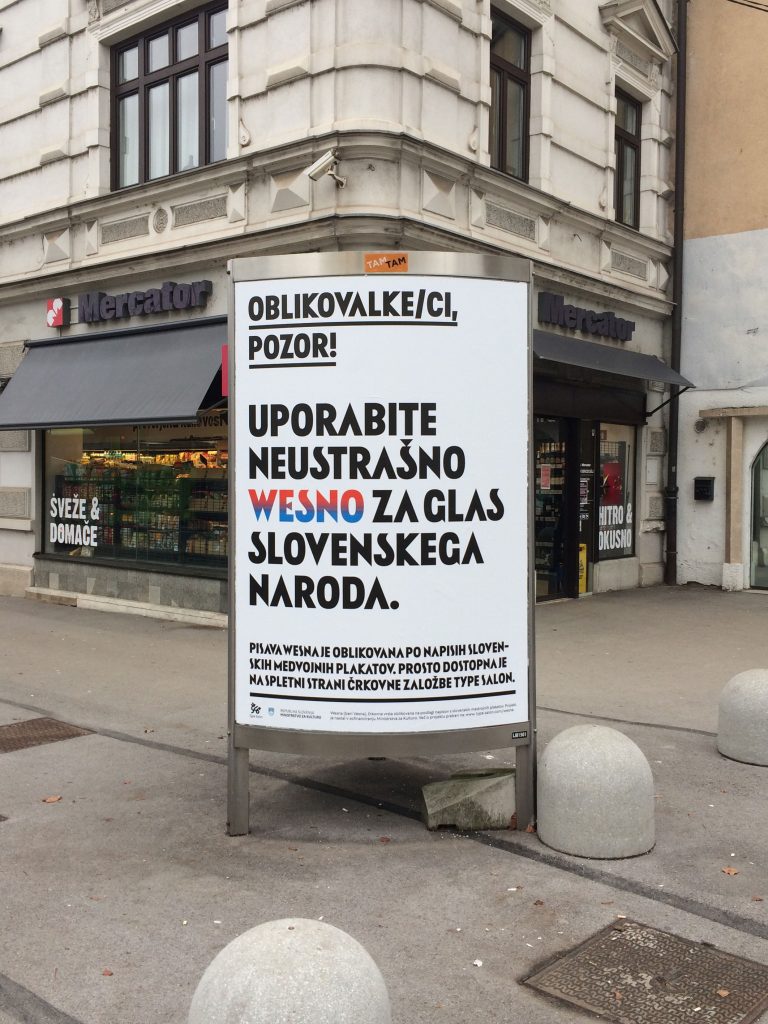
More about the project, follow the link: http://www.type-salon.com/wesna where you can also download the typeface for commercial use (free).
The project is co-financed by the Ministry of Culture, Slovenia.