Type Days Ljubljana 2017 (as organizer)
Type Days Ljubljana 2017 was 31th TipoBrda‘s type design workshop. TipoBrda is Slovenian society working and organizing typographic workshops in Slovenia since 1997. As I already mentioned, after working in Berlin I became very enthusiastic about oganizing typographical meetings & events in Slo. Head of TipoBrda, Domen Fras, asked us (me & Krista) to organize winter workshop and we accepted the offer with our arms wide open (as we say it in Slo). It took us at least one month to organize the whole event, from skratch to final exhibition. My head was full of ideas every dat since we became the organizing team. Even though it was not easy we can say it paid off seeing participant satisfied with the knowledge they received.
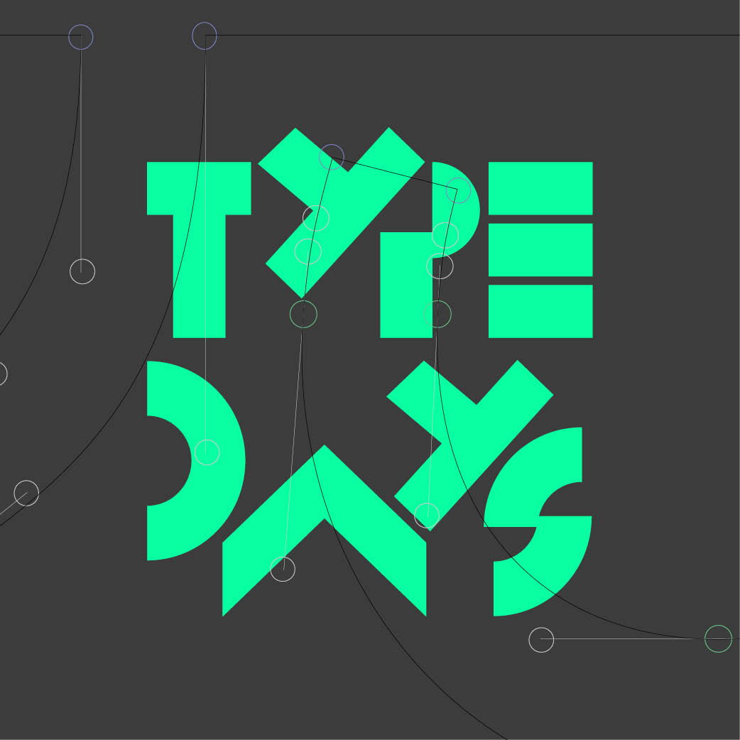
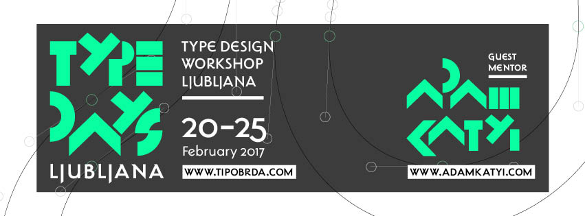
We decided to use a typeface Makalonca that was designed by Lucijan Bratuš. The typeface was based on the lettering from famous architect J. Plečnik. Design for the logotype Type Days came spontaneously – while waiting for a meeting we played with Bruno Munari’s game Abc con fantasia and combined designed letters: type days.
This year we took an opportunity and invited mentor from abroad – Adam Katyi, who is a great type designer and ownns type foundry Hungarumlaut.
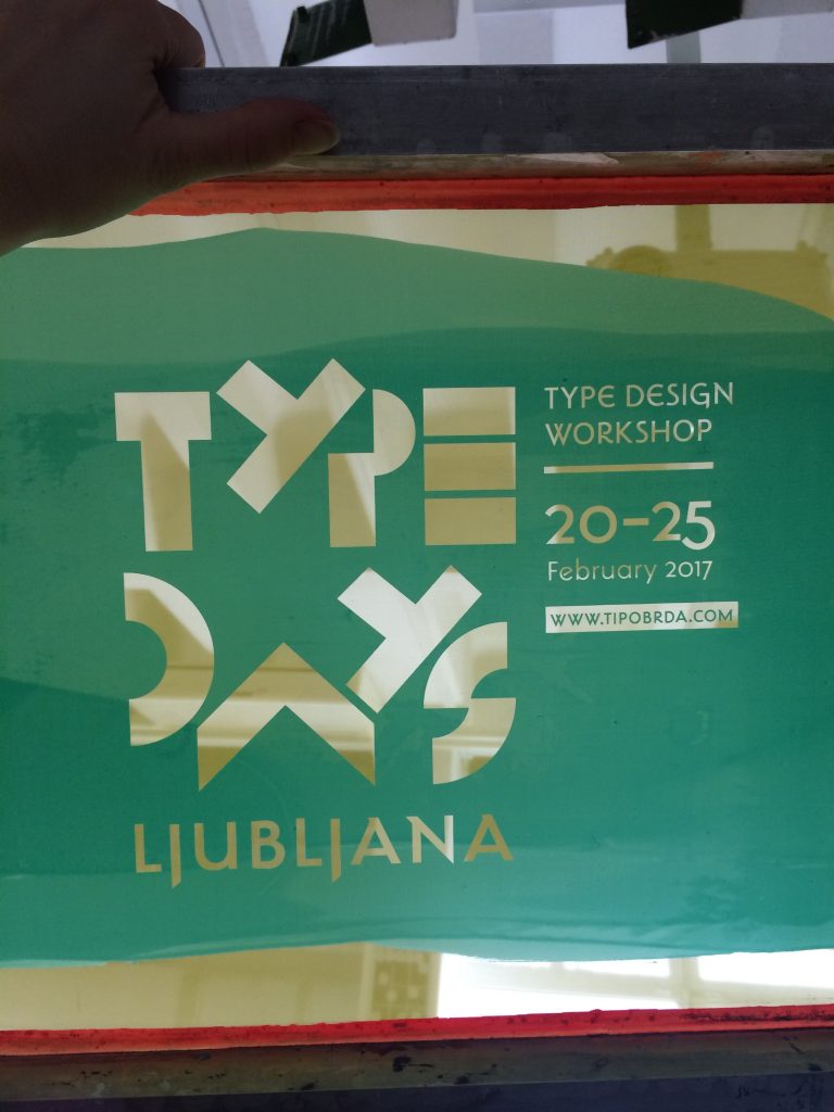
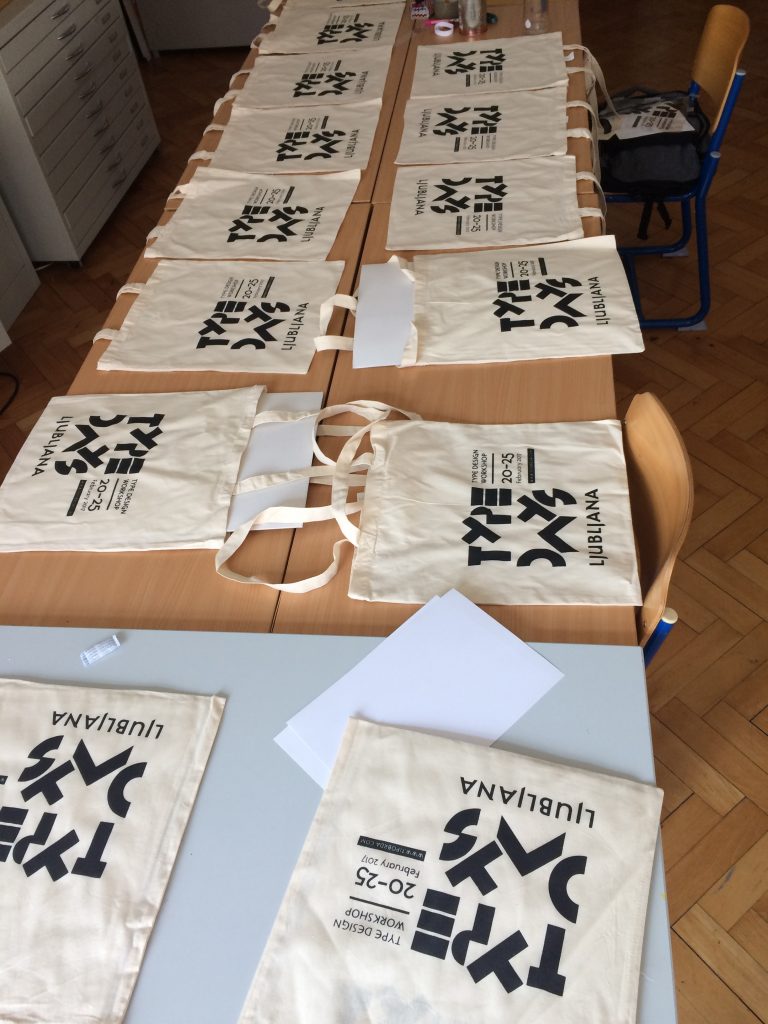
Me & Krista wanted to make a small gifts for participants. We decided to make goodie bags and Type Days t-shirts printed by hand, which we did by screen-printing. I have to admit, it was first time for me, doing the whole screen-print process and it was great learing experience. We have to thank our faculty NTF for allowing us to print there and also Goat story for donating t-shirts.

___________________________________________________________________________________________________
Here is a short review of the workshop Type Days Ljubljana 2017, 20–25 Feb. 31th TipoBrda.
Day 1. Sketching

We gathered in Vodnikova domačija for breakfast and everybody introduced themselves. We presented our mentor Adam Katyi and the timeline for the workshop. Professors Domen Fras and Lucijan Bratuš, mentors of the workshops, done in previous years, also came to visit us for a morning coffee. Adam started the workshop with a presentation, introducing us to the theory of the stroke. He put the focus on the importance of the contrast of the strokes and other important parameters.
After that he drew sketches showing transitional contrast starting with parallel pen and continuing with black markers. With only two letters drawn n and b and the help of transparent paper he ended up with a nice set of characters. Each of participants got a pile of paper and started sketching. We used transparent paper to copy every couple of sketched letters, and each new letter that we drew was more specifically detailed. By the end of the day, each participant got a brief idea of how their typeface would look like.
___________________________________________________________________________________________________
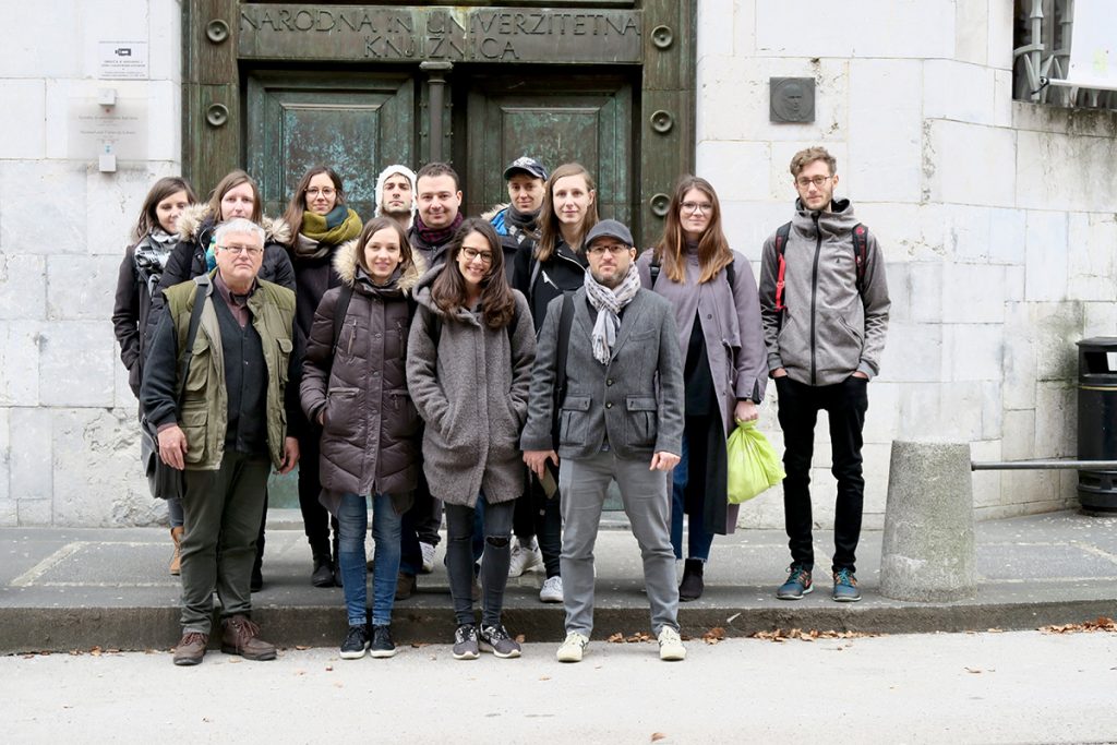
Day 2. Visiting NUK and sketching
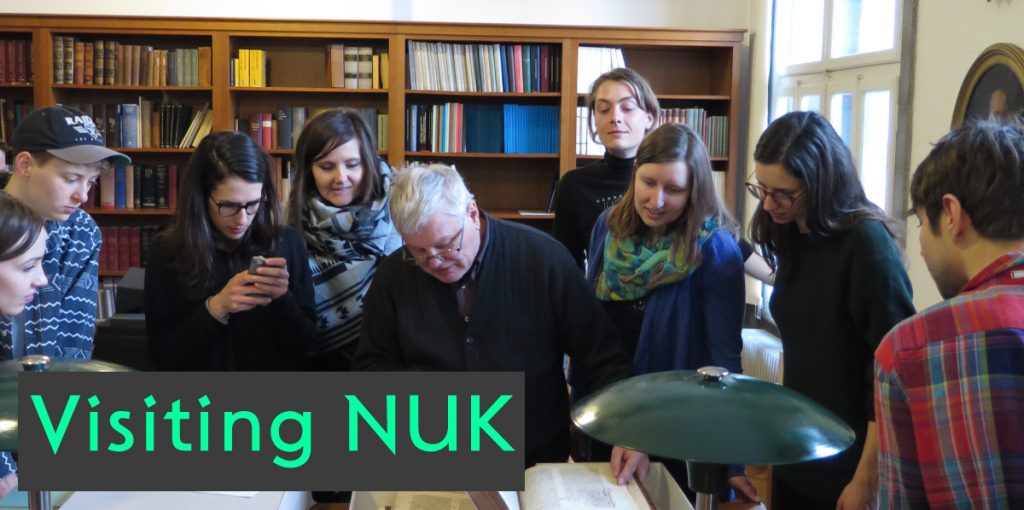
We met in front of National and University Library (NUK) in the center of Ljubljana. First, we showed the importance of the building from architectural point of view. Jože Plečnik – the greatest slovenian architect, besides being an inspiring architect, also had a big influence on graphic design and typography. The support type that we were using for Type Days 2017 visual identity is actually a revival from his lettering for a book Makalonca digitized by Lucijan Bratuš.
In the Department of Manuscript’s, Professor Lucijan Bratuš showed us manuscripts up to 700 years old. NUK has also stored some of the first slovenian printed books. He pointed out the development and the importance of these books back in 15th century. Seeing our heritage as scripts and first printed books was an unforgettable experience. After lunch, we returned to Vodnikova domačija and continued with sketching. We tried to develop stronger characters for our typefaces.
___________________________________________________________________________________________________
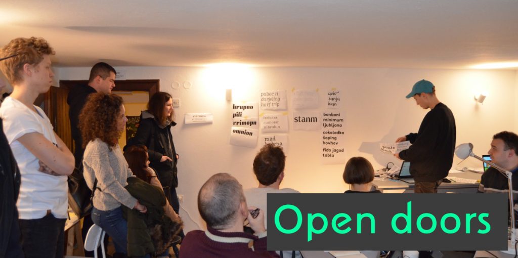
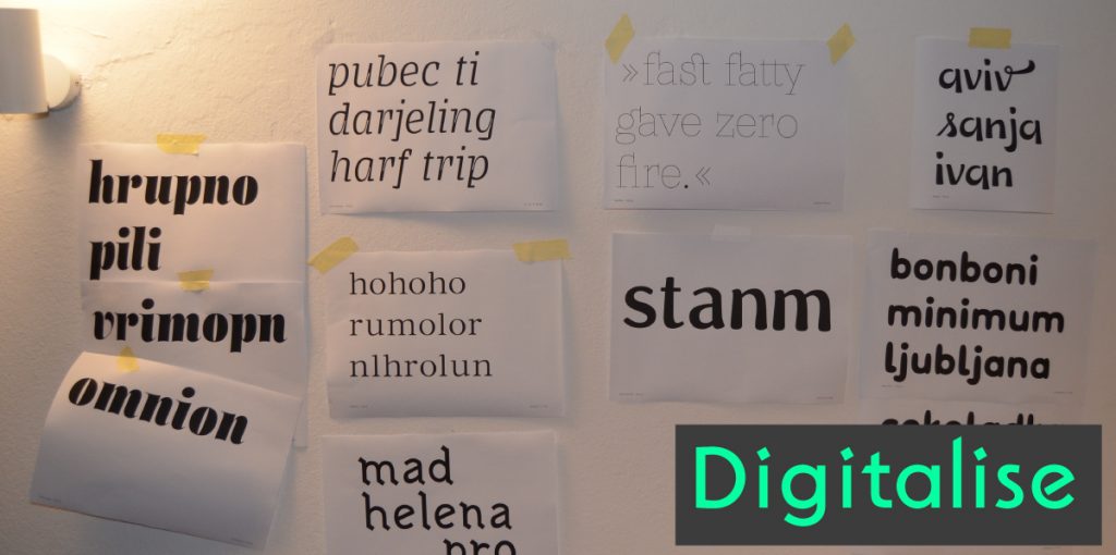
Day 3. Digitalizing, open doors, Adam’s talk
After breakfast, Adam had a speech about working with the Bézier curves in Glyphs. He showed us basics on how to draw curves with extremes and how to handle the nodes. He pointed out that just by drawing the letters n and p, we can get parts of letters (like components) which we can use for developing a lot of characters further on. We scanned our sketches and digitalized them in the program. By designing the letter n we can continue with letters h, m, i, u, l and a, we can use some components to build other, more tricky glyphs.
We opened our doors for public at 6pm. At the same time, we showed our first prints of the digitalised letters by putting them on a wall. Each of participants presented the idea behind her⁄his typeface to visitors. Later on Adam had a speech for public titled “A day of a type designer”. He presented us the story behind his latest typeface the Mohol family. The main message of his lecture was to have fun while designing your typeface, even if it is not a real project, you never know, maybe someday it will be useful.
___________________________________________________________________________________________________
Day 4. Digitalizing and corrections
On Thursday we continued digitalizing the letters and developing our typefaces. First we did some designing & corrections, after that was a coffee break, after that we continued with designing & corrections and some coffee and so on …
___________________________________________________________________________________________________
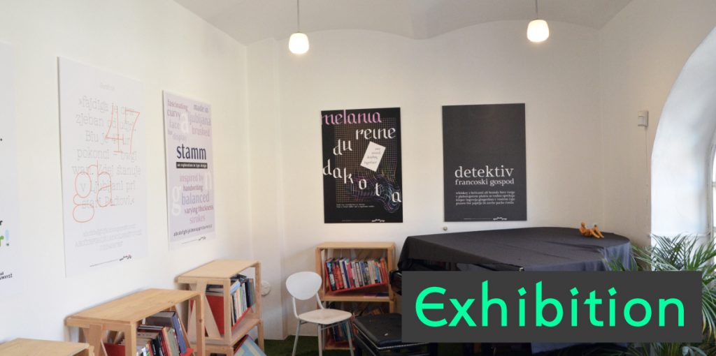
Day 5. Finalising, corrections, designing final poster

Friday was a bit hectic! Everyone rushed to finish their fonts and design of the final poster for the exhibition. The goal for the poster was to show your most beautiful letters – to present your typeface in the best way possible. After the busiest day of the week we had treated ourselves with a well-deserved drink at Kino Šiška.
___________________________________________________________________________________________________
Day 6. Typo walk, visiting letterpress studio TipoRenesansa & final exhibition
On our final day, we gathered in the center of Ljubljana for a Typo walk. We made a nice circle around the center of the city, where Lucijan showed and explained us a few interesting typographic signs and places. After that we visited a letterpress studio TipoRenesansa. The founder of the studio, Marko Drpić explained us the content of his studio which contains everything from calligraphy, letterpress, linocut, engraving to amazing historic printing equipment his studio possesses. His great knowledge about typography was a big inspiration for all of us.
Back in Vodnikova domačija our final posters were already waiting for us. Under Lucijan’s guidance we prepared the exhibition and opened it for public at 6pm. During the opening ceremony each of the participants got a goodie bag, full of goodies from all over the world. We finished an amazing and inspiring week with a small laidback party.
Photos Day 1,3,5: Adam Katyi
Photo Group: Lucijan Bratuš